- Power BI forums
- Updates
- News & Announcements
- Get Help with Power BI
- Desktop
- Service
- Report Server
- Power Query
- Mobile Apps
- Developer
- DAX Commands and Tips
- Custom Visuals Development Discussion
- Health and Life Sciences
- Power BI Spanish forums
- Translated Spanish Desktop
- Power Platform Integration - Better Together!
- Power Platform Integrations (Read-only)
- Power Platform and Dynamics 365 Integrations (Read-only)
- Training and Consulting
- Instructor Led Training
- Dashboard in a Day for Women, by Women
- Galleries
- Community Connections & How-To Videos
- COVID-19 Data Stories Gallery
- Themes Gallery
- Data Stories Gallery
- R Script Showcase
- Webinars and Video Gallery
- Quick Measures Gallery
- 2021 MSBizAppsSummit Gallery
- 2020 MSBizAppsSummit Gallery
- 2019 MSBizAppsSummit Gallery
- Events
- Ideas
- Custom Visuals Ideas
- Issues
- Issues
- Events
- Upcoming Events
- Community Blog
- Power BI Community Blog
- Custom Visuals Community Blog
- Community Support
- Community Accounts & Registration
- Using the Community
- Community Feedback
Register now to learn Fabric in free live sessions led by the best Microsoft experts. From Apr 16 to May 9, in English and Spanish.
- Power BI forums
- Forums
- Get Help with Power BI
- Desktop
- Re: Advanced line chart shows "ugly" dates
- Subscribe to RSS Feed
- Mark Topic as New
- Mark Topic as Read
- Float this Topic for Current User
- Bookmark
- Subscribe
- Printer Friendly Page
- Mark as New
- Bookmark
- Subscribe
- Mute
- Subscribe to RSS Feed
- Permalink
- Report Inappropriate Content
Advanced line chart shows "ugly" dates
Hi,
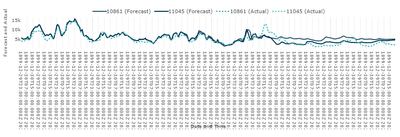
I have a visualization below (Advanced Line Chart (Pro)) and I would like to have prettier labels on the x-axis: just dates (without time) and not necessarily every date.
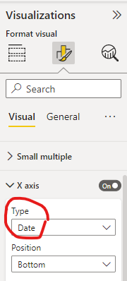
I tried changing the type of x-axis from Auto to Date, but I got an empty visualization with dates in year 2000, even though I have data from April 2023.
Data for visual:
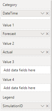
Relevant data looks like this (DateTime has type "Date/time", SimulationID "Whole number", Actual and Forecast "Decimal number"):
| DateTime | SimulationID | Actual | Forecast |
| 30/04/2023 00:00 | 10861 | 16634.83 | 15961.49 |
| 30/04/2023 00:00 | 11045 | 16634.83 | 15839.35 |
| 30/04/2023 01:00 | 10861 | 15870.4 | 15163.19 |
| 30/04/2023 01:00 | 11045 | 15870.4 | 15043.59 |
| 30/04/2023 02:00 | 10861 | 15421.92 | 14531.76 |
| 30/04/2023 02:00 | 11045 | 15421.92 | 14405.2 |
| 30/04/2023 03:00 | 10861 | 14843.06 | 14003.39 |
| 30/04/2023 03:00 | 11045 | 14843.06 | 13885.02 |
| 30/04/2023 04:00 | 10861 | 14510.63 | 13492.57 |
| 30/04/2023 04:00 | 11045 | 14510.63 | 13383.25 |
| 30/04/2023 05:00 | 10861 | 14543.72 | 12737.51 |
| 30/04/2023 05:00 | 11045 | 14543.72 | 12654.43 |
| 30/04/2023 06:00 | 10861 | 14735.5 | 12751.7 |
| 30/04/2023 06:00 | 11045 | 14735.5 | 12594.7 |
| 30/04/2023 07:00 | 10861 | 15345.42 | 13805.14 |
| 30/04/2023 07:00 | 11045 | 15345.42 | 13476.23 |
I would really appreciate any help.
Solved! Go to Solution.
- Mark as New
- Bookmark
- Subscribe
- Mute
- Subscribe to RSS Feed
- Permalink
- Report Inappropriate Content
None of the suggested methods produced the result I wanted. So I made a workaround and saved the data in another way:
- forecasted and actual values are in the same column,
- another simulation ID is added for the actual.
Then I used basic "Line chart" visualization to display the data.
- Mark as New
- Bookmark
- Subscribe
- Mute
- Subscribe to RSS Feed
- Permalink
- Report Inappropriate Content
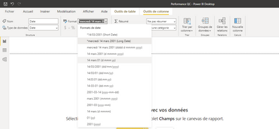
Try this:
In the report, select your column that corresponds to your date.
then, in "Column tools", change de "format type" as you prefer.
- Mark as New
- Bookmark
- Subscribe
- Mute
- Subscribe to RSS Feed
- Permalink
- Report Inappropriate Content
Do you need the timestamp date? You can either convert this to a date in Power Query or duplicate it in a new column and convert to date. It could be that you will need to convert it to date/time first before date.
If you have Auto/Date Time turned on, it will create a Hierarchy for you. You can then add Year, QTR, Month or Day to the visual
- Mark as New
- Bookmark
- Subscribe
- Mute
- Subscribe to RSS Feed
- Permalink
- Report Inappropriate Content
Thank you for your reply, with this I managed to make a graph on a daily granularity (where I have a column only with dates), which I also need.
But I would also need to have it on hourly granulation. If I try the same for hourly granularity, I get the error bellow:
- Mark as New
- Bookmark
- Subscribe
- Mute
- Subscribe to RSS Feed
- Permalink
- Report Inappropriate Content
Using the Timestamp column, Go to add column tab and Extract text after delimiter. The delimiter will be the a empty space. Just click on the keyboard once.
When the new column is created, in the Transform tab, click on extract first characters and choose 5. This will leave you with the time. Convert the column to time. You can then add this to the Matrix as a hierarchy
- Mark as New
- Bookmark
- Subscribe
- Mute
- Subscribe to RSS Feed
- Permalink
- Report Inappropriate Content
I tried using your method and used hierarchy of Date and Time:
And I get even longer x-axis labels, also the dates aren't correct anymore:
Previous version:
Helpful resources

Microsoft Fabric Learn Together
Covering the world! 9:00-10:30 AM Sydney, 4:00-5:30 PM CET (Paris/Berlin), 7:00-8:30 PM Mexico City

Power BI Monthly Update - April 2024
Check out the April 2024 Power BI update to learn about new features.

| User | Count |
|---|---|
| 107 | |
| 97 | |
| 75 | |
| 65 | |
| 53 |
| User | Count |
|---|---|
| 144 | |
| 103 | |
| 98 | |
| 85 | |
| 64 |


