New Offer! Become a Certified Fabric Data Engineer
Check your eligibility for this 50% exam voucher offer and join us for free live learning sessions to get prepared for Exam DP-700.
Get Started- Power BI forums
- Get Help with Power BI
- Desktop
- Service
- Report Server
- Power Query
- Mobile Apps
- Developer
- DAX Commands and Tips
- Custom Visuals Development Discussion
- Health and Life Sciences
- Power BI Spanish forums
- Translated Spanish Desktop
- Training and Consulting
- Instructor Led Training
- Dashboard in a Day for Women, by Women
- Galleries
- Community Connections & How-To Videos
- COVID-19 Data Stories Gallery
- Themes Gallery
- Data Stories Gallery
- R Script Showcase
- Webinars and Video Gallery
- Quick Measures Gallery
- 2021 MSBizAppsSummit Gallery
- 2020 MSBizAppsSummit Gallery
- 2019 MSBizAppsSummit Gallery
- Events
- Ideas
- Custom Visuals Ideas
- Issues
- Issues
- Events
- Upcoming Events
Don't miss out! 2025 Microsoft Fabric Community Conference, March 31 - April 2, Las Vegas, Nevada. Use code MSCUST for a $150 discount. Prices go up February 11th. Register now.
- Power BI forums
- Forums
- Get Help with Power BI
- Desktop
- Adding a legend removes/excludes values
- Subscribe to RSS Feed
- Mark Topic as New
- Mark Topic as Read
- Float this Topic for Current User
- Bookmark
- Subscribe
- Printer Friendly Page
- Mark as New
- Bookmark
- Subscribe
- Mute
- Subscribe to RSS Feed
- Permalink
- Report Inappropriate Content
Adding a legend removes/excludes values
Hi!
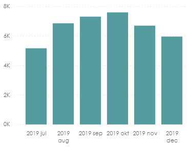
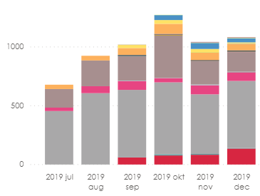
I have created a stacked bar-chart and when adding a Date-variable on the Axis and a measure on the Values it gives the correct output. Once I add a legend the output gives the wrong values. I have no filter enabled other than Year = 2019 and Month = July-December.
The chart without adding a legend (correct values):
The chart with a legend:
So, the only differences between the two charts above are the legend added.
I hope someone can help!
Thanks! 🙂
// BR
Solved! Go to Solution.
- Mark as New
- Bookmark
- Subscribe
- Mute
- Subscribe to RSS Feed
- Permalink
- Report Inappropriate Content
I found the solution:
For some reason the stacked bar chart can maximum display 58 different types of the legend. This means, that when I look at legends more than 58 types it chooses itself which to display.
Therefore, I added a filter to display only the top 58 filters by the measure used.
- Mark as New
- Bookmark
- Subscribe
- Mute
- Subscribe to RSS Feed
- Permalink
- Report Inappropriate Content
@Xilitor , I doubt join of legend with table or formula using some calculation on the legend
At the Microsoft Analytics Community Conference, global leaders and influential voices are stepping up to share their knowledge and help you master the latest in Microsoft Fabric, Copilot, and Purview. ✨
️ November 12th-14th, 2024
Online Event
Register Here
- Mark as New
- Bookmark
- Subscribe
- Mute
- Subscribe to RSS Feed
- Permalink
- Report Inappropriate Content
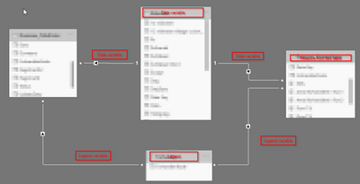
This is how it's connected:
Sorry for the blurring - I am using customer data.
- Mark as New
- Bookmark
- Subscribe
- Mute
- Subscribe to RSS Feed
- Permalink
- Report Inappropriate Content
I found the solution:
For some reason the stacked bar chart can maximum display 58 different types of the legend. This means, that when I look at legends more than 58 types it chooses itself which to display.
Therefore, I added a filter to display only the top 58 filters by the measure used.
- Mark as New
- Bookmark
- Subscribe
- Mute
- Subscribe to RSS Feed
- Permalink
- Report Inappropriate Content
I just using all 3 variables from the same table and I still experience the same problem. So it cannot be regarding the relationships. And I have done no calculations for any of variables for this chart. Could it be because of a back-end problem then?
- Mark as New
- Bookmark
- Subscribe
- Mute
- Subscribe to RSS Feed
- Permalink
- Report Inappropriate Content
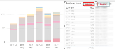
The legend detects the right number in a table but not in the chart.
E.g. selecting the legend in a table with the highest value doesn't highlight in the bar:
Helpful resources

Join us at the Microsoft Fabric Community Conference
March 31 - April 2, 2025, in Las Vegas, Nevada. Use code MSCUST for a $150 discount!

Power BI Monthly Update - January 2025
Check out the January 2025 Power BI update to learn about new features in Reporting, Modeling, and Data Connectivity.

| User | Count |
|---|---|
| 104 | |
| 69 | |
| 48 | |
| 41 | |
| 34 |
| User | Count |
|---|---|
| 164 | |
| 112 | |
| 62 | |
| 54 | |
| 38 |


