- Power BI forums
- Updates
- News & Announcements
- Get Help with Power BI
- Desktop
- Service
- Report Server
- Power Query
- Mobile Apps
- Developer
- DAX Commands and Tips
- Custom Visuals Development Discussion
- Health and Life Sciences
- Power BI Spanish forums
- Translated Spanish Desktop
- Power Platform Integration - Better Together!
- Power Platform Integrations (Read-only)
- Power Platform and Dynamics 365 Integrations (Read-only)
- Training and Consulting
- Instructor Led Training
- Dashboard in a Day for Women, by Women
- Galleries
- Community Connections & How-To Videos
- COVID-19 Data Stories Gallery
- Themes Gallery
- Data Stories Gallery
- R Script Showcase
- Webinars and Video Gallery
- Quick Measures Gallery
- 2021 MSBizAppsSummit Gallery
- 2020 MSBizAppsSummit Gallery
- 2019 MSBizAppsSummit Gallery
- Events
- Ideas
- Custom Visuals Ideas
- Issues
- Issues
- Events
- Upcoming Events
- Community Blog
- Power BI Community Blog
- Custom Visuals Community Blog
- Community Support
- Community Accounts & Registration
- Using the Community
- Community Feedback
Register now to learn Fabric in free live sessions led by the best Microsoft experts. From Apr 16 to May 9, in English and Spanish.
- Power BI forums
- Forums
- Get Help with Power BI
- Desktop
- Accumulate the values to get an increasing line ch...
- Subscribe to RSS Feed
- Mark Topic as New
- Mark Topic as Read
- Float this Topic for Current User
- Bookmark
- Subscribe
- Printer Friendly Page
- Mark as New
- Bookmark
- Subscribe
- Mute
- Subscribe to RSS Feed
- Permalink
- Report Inappropriate Content
Accumulate the values to get an increasing line chart
Hi,
I have a database in which we log at around every 15 minutes the number of tablets produced. I have a date and a qunatity.
We would need to see a line chart that accumulates the values, generating an increasing line.
For Example:
At 6.30 we start from 0
At 6.45 we produced 10.000 tablets
At 7.05 we produced another 12.000 tablets
At 7.30 we produced another 16.000 tablets.
My data looks like this
Date&Time Qunatity
6.30 0
6.45 10.000
7.05 12.000
7.30 16.000
On the line chart I would like to se ponits at the following values:
At 6.30 : 0
At 6.45 : 10.000
At 7.05 : 22.000 (10.000+12.000)
At 7.30 : 38.000 (10.000+12.000+16.000)
Thank you,
Nandor
Solved! Go to Solution.
- Mark as New
- Bookmark
- Subscribe
- Mute
- Subscribe to RSS Feed
- Permalink
- Report Inappropriate Content
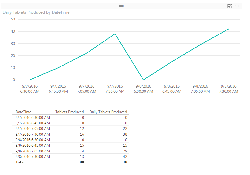
Hi @Nandor. See if the picture below is what you had in mind. I'm not sure what you want to do when you start another day, so I set it to reset to 0 each new day with some made up data.
I noticed the heading of your column is Date&Time, but I only saw time values in the sample. I'm assuming you either have a date as well, or maybe it's in another column. Here's what I ended up with:
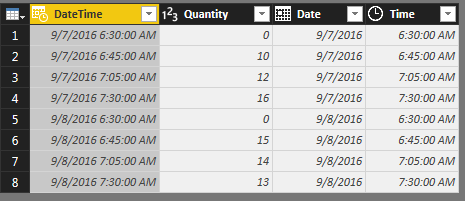
Starting with a DateTime column and Quantity column, I added the separate Date and Time columns in the Query Editor. To do that, select the DateTime column, then go to the Add Column tab in the ribbon, click the Date drop-down, and select Date Only. For the Time column, you'll do the same, except you'll click the Time drop-down and select Time Only.
After you Close and Apply to load your data, create two new measures (Modeling tab in the ribbon > New Measure).
Tablets Produced = SUM(TableName[Quantity])
Daily Tablets Produced = CALCULATE(
	[Tablets Produced],
	FILTER(ALL(TableName), TableName[Date]=MIN(TableName[Date])
		&& TableName[Time]<=MAX(TableName[Time]))
	)
The measure names are up to you. For the chart, drag the DateTime column onto the report canvas. Change the visual to a Line chart in the Visualizations pane, and then under Axis you'll probably need to click the DateTime field drop-down and select DateTime instead of the defaulted Date Hierarchy. Then drag the Daily Tablets Produced measure into the Values section of the chart.
To get the line chart to show every measurement time, click the Format section while the chart is selected, and click the drop-down under X-Axis to see the options there. Chagne the type from Continuous to Categorical.
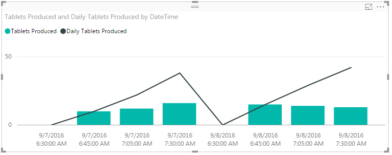
If you also wanted a visualization of how many were produced each hour, you could then change the chart to a Line and Clustered Column chart. Drag Daily Tablets Produced to the Line Values and add Tablets Produced to the Column Values. It would end up like this:
- Mark as New
- Bookmark
- Subscribe
- Mute
- Subscribe to RSS Feed
- Permalink
- Report Inappropriate Content
Hi, thank you for the solution, you were lightning fast.
Thank you again,
Nandor
- Mark as New
- Bookmark
- Subscribe
- Mute
- Subscribe to RSS Feed
- Permalink
- Report Inappropriate Content
Hi, I need your help again, I can't figure it out why my data difer form the original values.
I exported the following table from Power BI, and column 2 and 3 should be almoust equal, differences should be only a few tablets, as seen on the last column.
The calculation of the number of tablets between two calculations is correct (as can be seen in rows 4,5 and 6, I used the following excel formula to calculate the values: =IF(B4-B3>0,B4-B3,0)), exept that it misses one value when we restart from zero, because a new batch was started. Could you help me to finetune the formula you gave in the solution to eliminate the problems at the start of the batches?
At the beginnig of each batch it is normal to have two identical number of tablets, because the equipment is started for a short time than it waits for thein process controll. When restarted the same value is introduced again.
| Measurement_Date&Time | Measurement_Quantity | TabletsProduced_Daily | Tablets produced (calculated in excel) | TabletsProduced | Difference between excel and DEX |
| 05/09/2016 06:29 | 0 | 0 | 0 | 0 | Differences come from my calculation, the only value that we ned to look into is 4262 in line 33 |
| 05/09/2016 09:00 | 0 | 9593 | 0 | 0 | |
| 05/09/2016 09:01 | 4420 | 9593 | 4420 | 0 | |
| 05/09/2016 09:31 | 4420 | 14080 | 0 | 0 | |
| 05/09/2016 09:47 | 23490 | 34725 | 19070 | 19065 | 5 |
| 05/09/2016 10:06 | 43399 | 58818 | 19909 | 19893 | 16 |
| 05/09/2016 10:20 | 58090 | 73504 | 14691 | 14686 | 5 |
| 05/09/2016 10:37 | 76495 | 94145 | 18405 | 18394 | 11 |
| 05/09/2016 10:52 | 91390 | 111835 | 14895 | 14882 | 13 |
| 05/09/2016 11:08 | 108857 | 133607 | 17467 | 17456 | 11 |
| 05/09/2016 11:25 | 126775 | 153425 | 17918 | 17918 | 0 |
| 05/09/2016 11:41 | 143610 | 170257 | 16835 | 16832 | 3 |
| 05/09/2016 11:53 | 155999 | 184989 | 12389 | 12386 | 3 |
| 05/09/2016 12:06 | 168875 | 199365 | 12876 | 12876 | 0 |
| 05/09/2016 12:23 | 187525 | 220414 | 18650 | 18649 | 1 |
| 05/09/2016 12:42 | 206520 | 241934 | 18995 | 18990 | 5 |
| 05/09/2016 12:55 | 220985 | 256390 | 14465 | 14456 | 9 |
| 05/09/2016 13:12 | 238215 | 277891 | 17230 | 17216 | 14 |
| 05/09/2016 13:28 | 255525 | 297995 | 17310 | 17296 | 14 |
| 05/09/2016 13:42 | 270315 | 312779 | 14790 | 14784 | 6 |
| 05/09/2016 14:05 | 294325 | 341220 | 24010 | 24002 | 8 |
| 05/09/2016 14:21 | 310435 | 359745 | 16110 | 16110 | 0 |
| 05/09/2016 14:37 | 327425 | 376721 | 16990 | 16976 | 14 |
| 05/09/2016 14:50 | 341500 | 392983 | 14075 | 14066 | 9 |
| 05/09/2016 15:07 | 358600 | 412571 | 17100 | 17088 | 12 |
| 05/09/2016 15:26 | 379200 | 433167 | 20600 | 20596 | 4 |
| 05/09/2016 15:40 | 392085 | 446050 | 12885 | 12883 | 2 |
| 05/09/2016 15:55 | 408900 | 462865 | 16815 | 16815 | 0 |
| 05/09/2016 16:09 | 424300 | 480253 | 15400 | 15400 | 0 |
| 05/09/2016 16:41 | 446771 | 502697 | 22471 | 22444 | 27 |
| 05/09/2016 17:52 | 0 | 505236 | 0 | 0 | 0 |
| 05/09/2016 18:00 | 0 | 506614 | 0 | 0 | 0 |
| 05/09/2016 18:00 | 4262 | 506614 | 4262 | 0 | 4262 |
| 05/09/2016 18:26 | 4262 | 506614 | 0 | 0 | 0 |
| 05/09/2016 18:32 | 18780 | 521129 | 14518 | 14515 | 3 |
| 05/09/2016 18:49 | 36210 | 540613 | 17430 | 17424 | 6 |
| 05/09/2016 19:07 | 55260 | 559657 | 19050 | 19044 | 6 |
| 05/09/2016 19:22 | 70600 | 579099 | 15340 | 15330 | 10 |
| 05/09/2016 19:37 | 87110 | 595599 | 16510 | 16500 | 10 |
| 05/09/2016 20:02 | 112600 | 623187 | 25490 | 25488 | 2 |
| 05/09/2016 20:18 | 129600 | 643713 | 17000 | 16992 | 8 |
| 05/09/2016 20:35 | 147200 | 661313 | 17600 | 17600 | 0 |
| 05/09/2016 20:50 | 163802 | 683135 | 16602 | 16590 | 12 |
| 05/09/2016 21:09 | 183200 | 705296 | 19398 | 19386 | 12 |
| 05/09/2016 21:24 | 198700 | 720992 | 15500 | 15498 | 2 |
| 05/09/2016 21:48 | 220351 | 744522 | 21651 | 21643 | 8 |
| Total/day | 667122 | 744522 |
Thank you,
Nandor
Helpful resources

Microsoft Fabric Learn Together
Covering the world! 9:00-10:30 AM Sydney, 4:00-5:30 PM CET (Paris/Berlin), 7:00-8:30 PM Mexico City

Power BI Monthly Update - April 2024
Check out the April 2024 Power BI update to learn about new features.

| User | Count |
|---|---|
| 112 | |
| 100 | |
| 76 | |
| 74 | |
| 49 |
| User | Count |
|---|---|
| 146 | |
| 108 | |
| 106 | |
| 90 | |
| 62 |


