Go To
- Power BI forums
- Updates
- News & Announcements
- Get Help with Power BI
- Desktop
- Service
- Report Server
- Power Query
- Mobile Apps
- Developer
- DAX Commands and Tips
- Custom Visuals Development Discussion
- Health and Life Sciences
- Power BI Spanish forums
- Translated Spanish Desktop
- Power Platform Integration - Better Together!
- Power Platform Integrations (Read-only)
- Power Platform and Dynamics 365 Integrations (Read-only)
- Training and Consulting
- Instructor Led Training
- Dashboard in a Day for Women, by Women
- Galleries
- Community Connections & How-To Videos
- COVID-19 Data Stories Gallery
- Themes Gallery
- Data Stories Gallery
- R Script Showcase
- Webinars and Video Gallery
- Quick Measures Gallery
- 2021 MSBizAppsSummit Gallery
- 2020 MSBizAppsSummit Gallery
- 2019 MSBizAppsSummit Gallery
- Events
- Ideas
- Custom Visuals Ideas
- Issues
- Issues
- Events
- Upcoming Events
- Community Blog
- Power BI Community Blog
- Custom Visuals Community Blog
- Community Support
- Community Accounts & Registration
- Using the Community
- Community Feedback
Turn on suggestions
Auto-suggest helps you quickly narrow down your search results by suggesting possible matches as you type.
Showing results for
Earn a 50% discount on the DP-600 certification exam by completing the Fabric 30 Days to Learn It challenge.
- Power BI forums
- Forums
- Get Help with Power BI
- Desktop
- Accentuating a period that is longer than 10 days ...
Reply
Topic Options
- Subscribe to RSS Feed
- Mark Topic as New
- Mark Topic as Read
- Float this Topic for Current User
- Bookmark
- Subscribe
- Printer Friendly Page
- Mark as New
- Bookmark
- Subscribe
- Mute
- Subscribe to RSS Feed
- Permalink
- Report Inappropriate Content
Accentuating a period that is longer than 10 days and higher than 15 degrees
10-22-2021
02:40 AM
Hi,
In the scenario below i have a date and temperature column.
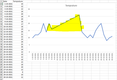
What we are trying to visualize is accentuating a period that is longer than 10 days and higher than 15 degrees. Like the Excel example below.
Who can help me visualise this?
Thanks,
Stefan
Solved! Go to Solution.
1 ACCEPTED SOLUTION
- Mark as New
- Bookmark
- Subscribe
- Mute
- Subscribe to RSS Feed
- Permalink
- Report Inappropriate Content
10-22-2021
06:18 AM
Hi,
try this measure:
Temperature_15_and_higher =
VAR _cur_date = SELECTEDVALUE ( Temp[Date] )
VAR _first_date_before_below_15 =
MAXX (
FILTER (
ALL ( Temp ),
Temp[Date] <= _cur_date &&
Temp[Date] >= _cur_date - 9 &&
Temp[Temprature] < 15
),
Temp[Date]
)
VAR _first_date_after_below_15 =
MINX (
FILTER (
ALL ( Temp ),
Temp[Date] >= _cur_date &&
Temp[Date] <= _cur_date + 9 &&
Temp[Temprature] < 15
),
Temp[Date]
)
VAR _number_of_days =
IF ( ISBLANK ( _first_date_before_below_15 ), 10, INT(_cur_date - _first_date_before_below_15) ) +
IF ( ISBLANK ( _first_date_after_below_15 ), 10, INT(_first_date_after_below_15 - _cur_date) ) -
1
RETURN
IF ( _number_of_days >= 10, SELECTEDVALUE(Temp[Temprature]), BLANK() )
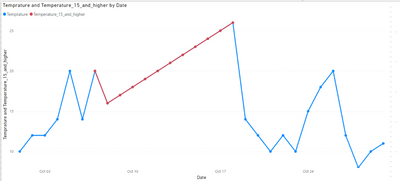
We can put this measure along with Temprature field on the visual. The result is next:
1 REPLY 1
- Mark as New
- Bookmark
- Subscribe
- Mute
- Subscribe to RSS Feed
- Permalink
- Report Inappropriate Content
10-22-2021
06:18 AM
Hi,
try this measure:
Temperature_15_and_higher =
VAR _cur_date = SELECTEDVALUE ( Temp[Date] )
VAR _first_date_before_below_15 =
MAXX (
FILTER (
ALL ( Temp ),
Temp[Date] <= _cur_date &&
Temp[Date] >= _cur_date - 9 &&
Temp[Temprature] < 15
),
Temp[Date]
)
VAR _first_date_after_below_15 =
MINX (
FILTER (
ALL ( Temp ),
Temp[Date] >= _cur_date &&
Temp[Date] <= _cur_date + 9 &&
Temp[Temprature] < 15
),
Temp[Date]
)
VAR _number_of_days =
IF ( ISBLANK ( _first_date_before_below_15 ), 10, INT(_cur_date - _first_date_before_below_15) ) +
IF ( ISBLANK ( _first_date_after_below_15 ), 10, INT(_first_date_after_below_15 - _cur_date) ) -
1
RETURN
IF ( _number_of_days >= 10, SELECTEDVALUE(Temp[Temprature]), BLANK() )
We can put this measure along with Temprature field on the visual. The result is next:
Helpful resources
Featured Topics
Top Solution Authors
| User | Count |
|---|---|
| 102 | |
| 90 | |
| 80 | |
| 71 | |
| 70 |
Top Kudoed Authors
| User | Count |
|---|---|
| 114 | |
| 100 | |
| 97 | |
| 72 | |
| 71 |


