- Power BI forums
- Updates
- News & Announcements
- Get Help with Power BI
- Desktop
- Service
- Report Server
- Power Query
- Mobile Apps
- Developer
- DAX Commands and Tips
- Custom Visuals Development Discussion
- Health and Life Sciences
- Power BI Spanish forums
- Translated Spanish Desktop
- Power Platform Integration - Better Together!
- Power Platform Integrations (Read-only)
- Power Platform and Dynamics 365 Integrations (Read-only)
- Training and Consulting
- Instructor Led Training
- Dashboard in a Day for Women, by Women
- Galleries
- Community Connections & How-To Videos
- COVID-19 Data Stories Gallery
- Themes Gallery
- Data Stories Gallery
- R Script Showcase
- Webinars and Video Gallery
- Quick Measures Gallery
- 2021 MSBizAppsSummit Gallery
- 2020 MSBizAppsSummit Gallery
- 2019 MSBizAppsSummit Gallery
- Events
- Ideas
- Custom Visuals Ideas
- Issues
- Issues
- Events
- Upcoming Events
- Community Blog
- Power BI Community Blog
- Custom Visuals Community Blog
- Community Support
- Community Accounts & Registration
- Using the Community
- Community Feedback
Register now to learn Fabric in free live sessions led by the best Microsoft experts. From Apr 16 to May 9, in English and Spanish.
- Power BI forums
- Forums
- Get Help with Power BI
- Desktop
- 100% stacked Bar Chart - Unusual rendering on Web ...
- Subscribe to RSS Feed
- Mark Topic as New
- Mark Topic as Read
- Float this Topic for Current User
- Bookmark
- Subscribe
- Printer Friendly Page
- Mark as New
- Bookmark
- Subscribe
- Mute
- Subscribe to RSS Feed
- Permalink
- Report Inappropriate Content
100% stacked Bar Chart - Unusual rendering on Web service
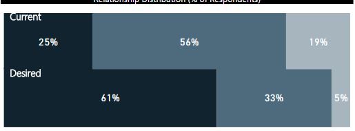
Hi, I just wanted to check if anyone else has experienced the below issue with "100% stacked Bar Chart" visual on the web dashboard (on pbi file, it looks as normal as it should). I have used this visual in many dashboards (it serves exact purpose), but this issue is raising a lot of questions. Is there a fix, or how can I report it to microsoft.
Web View
Desk View
Solved! Go to Solution.
- Mark as New
- Bookmark
- Subscribe
- Mute
- Subscribe to RSS Feed
- Permalink
- Report Inappropriate Content
Hi @Anonymous,
Did you mean the 100% stacked Bar Chart always display in an incorrect format on Power BI service site? If you recreate the chart, republish the file to service, does issue persist?
I was not able to reproduce your issue, it worked fine in both desktop and service. You could create a support ticket on this page to report your issue: https://powerbi.microsoft.com/en-us/support/. If you get the useful response that can resolve your issue, appreciate that you can share it.
Best regards,
Yuliana Gu
If this post helps, then please consider Accept it as the solution to help the other members find it more quickly.
- Mark as New
- Bookmark
- Subscribe
- Mute
- Subscribe to RSS Feed
- Permalink
- Report Inappropriate Content
Hi, Thanks for your response. I see that, it was fixed in June release. I got the visual rednering same on my PBI desktop file as well, post update. And, then I had to fix and re-publish it.
It works as intended now.
Regards,
Helpful resources

Microsoft Fabric Learn Together
Covering the world! 9:00-10:30 AM Sydney, 4:00-5:30 PM CET (Paris/Berlin), 7:00-8:30 PM Mexico City

Power BI Monthly Update - April 2024
Check out the April 2024 Power BI update to learn about new features.

| User | Count |
|---|---|
| 106 | |
| 98 | |
| 80 | |
| 67 | |
| 63 |
| User | Count |
|---|---|
| 145 | |
| 111 | |
| 104 | |
| 84 | |
| 64 |


