- Power BI forums
- Updates
- News & Announcements
- Get Help with Power BI
- Desktop
- Service
- Report Server
- Power Query
- Mobile Apps
- Developer
- DAX Commands and Tips
- Custom Visuals Development Discussion
- Health and Life Sciences
- Power BI Spanish forums
- Translated Spanish Desktop
- Power Platform Integration - Better Together!
- Power Platform Integrations (Read-only)
- Power Platform and Dynamics 365 Integrations (Read-only)
- Training and Consulting
- Instructor Led Training
- Dashboard in a Day for Women, by Women
- Galleries
- Community Connections & How-To Videos
- COVID-19 Data Stories Gallery
- Themes Gallery
- Data Stories Gallery
- R Script Showcase
- Webinars and Video Gallery
- Quick Measures Gallery
- 2021 MSBizAppsSummit Gallery
- 2020 MSBizAppsSummit Gallery
- 2019 MSBizAppsSummit Gallery
- Events
- Ideas
- Custom Visuals Ideas
- Issues
- Issues
- Events
- Upcoming Events
- Community Blog
- Power BI Community Blog
- Custom Visuals Community Blog
- Community Support
- Community Accounts & Registration
- Using the Community
- Community Feedback
Register now to learn Fabric in free live sessions led by the best Microsoft experts. From Apr 16 to May 9, in English and Spanish.
- Power BI forums
- Galleries
- Data Stories Gallery
- US Mortality Rates 1980-2014
US Mortality Rates 1980-2014
08-07-2017 21:03 PM - last edited 08-07-2017 21:33 PM


- Mark as New
- Bookmark
- Subscribe
- Mute
- Subscribe to RSS Feed
- Permalink
- Report Inappropriate Content
US Mortality Rates 1980-2014
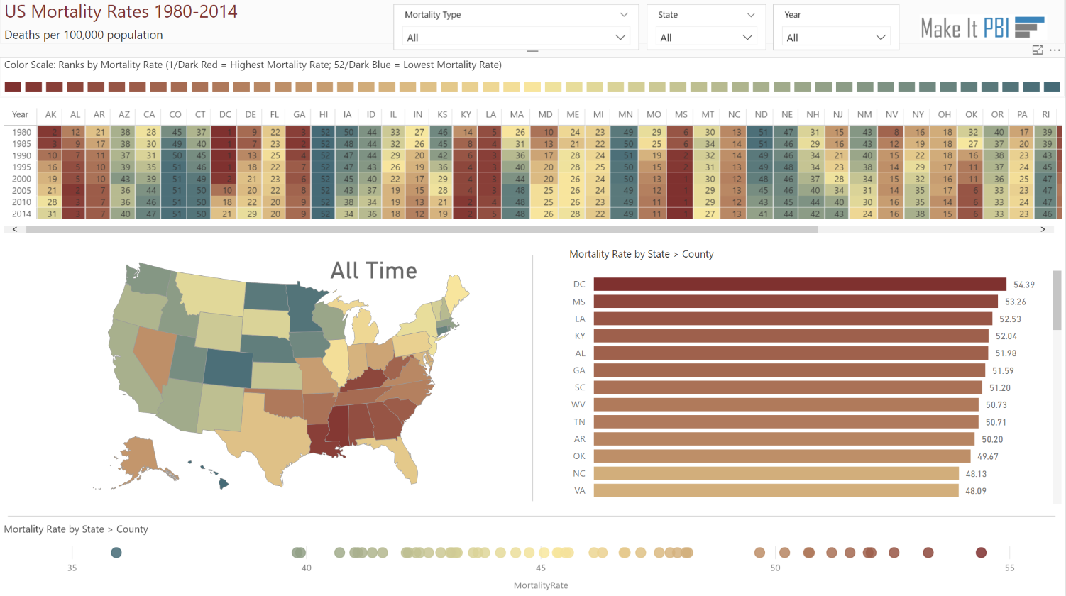
This is a re-creation of an existing data viz on the International Health Metrics and Evaluation website.
Allow me to briefly lay out the features of this viz:
1. Slicers at the top allow you to slice the data on Mortality Type (e.g. Cardiovascular Disease), State, and Year.
2. A color scale just below the slicers provides context to the visuals. I created this color scale with a 100% stacked column chart. I just hid the x and y axes and used the mortality rankings as the values and as the color saturation.
3. The heatmap was created using the matrix. Typically you would have years across the top (columns); however, since there are much fewer years than states (note: District of Columbia, though not a state, is included in the dataset), it made more sense to have the states on the columns and the years on the rows. This way it spans the entire width of the page. The heatmap, which is colored by mortality ranking (1/dark red=high mortality rate helps you see; 52/dark blue=low mortality rating), helps you see changes over the years by each state.
4. The choropleth map provides insight into regional mortality rates.
5. Then you have your standard bar chart with mortality rate on color saturation. You can drill down to the county level.
6. Lastly, you have a scatterplot across the bottom, but only the x-axis is utilized (by mortality rate) and is color formatted by mortality rate. This helps you see the distribution of the data. You can also drill down to the county level. I wanted to use the Play Axis, but it doesn't seem to work if you only use one axis. If anyone knows any way around this, please let me know.
I hope you enjoy the data viz. Please let me know if you have any recommendations or if you notice any errors. Thank you.
You can check out more of my Power BI creations at Make It PBI.
eyJrIjoiM2U4ZDRlOTItNTFhNS00ODM1LTg3YTMtZTdmZjEyMGQyOTk0IiwidCI6IjZkNjM4YjFhLTMyYmYtNGJhMy1iNGI0LWU4NjU1MzcyNmZiMSIsImMiOjZ9