- Power BI forums
- Updates
- News & Announcements
- Get Help with Power BI
- Desktop
- Service
- Report Server
- Power Query
- Mobile Apps
- Developer
- DAX Commands and Tips
- Custom Visuals Development Discussion
- Health and Life Sciences
- Power BI Spanish forums
- Translated Spanish Desktop
- Power Platform Integration - Better Together!
- Power Platform Integrations (Read-only)
- Power Platform and Dynamics 365 Integrations (Read-only)
- Training and Consulting
- Instructor Led Training
- Dashboard in a Day for Women, by Women
- Galleries
- Community Connections & How-To Videos
- COVID-19 Data Stories Gallery
- Themes Gallery
- Data Stories Gallery
- R Script Showcase
- Webinars and Video Gallery
- Quick Measures Gallery
- 2021 MSBizAppsSummit Gallery
- 2020 MSBizAppsSummit Gallery
- 2019 MSBizAppsSummit Gallery
- Events
- Ideas
- Custom Visuals Ideas
- Issues
- Issues
- Events
- Upcoming Events
- Community Blog
- Power BI Community Blog
- Custom Visuals Community Blog
- Community Support
- Community Accounts & Registration
- Using the Community
- Community Feedback
Register now to learn Fabric in free live sessions led by the best Microsoft experts. From Apr 16 to May 9, in English and Spanish.
- Power BI forums
- Galleries
- Data Stories Gallery
- Re: Sales Scorecard: Where are we losing money?
Re: Sales Scorecard: Where are we losing money?
06-04-2018 06:15 AM


- Mark as New
- Bookmark
- Subscribe
- Mute
- Subscribe to RSS Feed
- Permalink
- Report Inappropriate Content
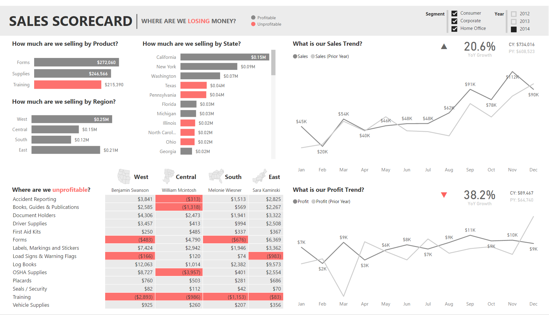
Sales Scorecard: Where are we losing money? by Decisive Data
Summary
"How is my company doing?"
It's a question we hear often. It seems simple enough, but answering it is a complex process. This report is designed to answer the question in a clear and straightforward manner, while providing enough detail to take some action.
If we wanted to further develop this story, we would build on the outcomes of our Sales Scorecard by adding additional reports with more granular data. Each of these report tabs would answer one specific question that arises from use of our Sales Scorecard.
Approach
A report is most valuable when it's actionable. We started by identifying which components of the process we can influence:
- What we're selling (products)
- Where we're selling (region, state)
- When we're selling (month, year)
- Who is doing the selling (salesperson)
We then determined the report's focus: areas that are not performing well. We used color to highlight these problem areas, and leveraged a matrix with conditional formatting to give us granular insights that could prompt strategy changes. Finally, we included comparisons of profit and sales against prior years to put the performance into perspective. We leveraged basic Power BI elements (cards, shapes, tree maps, and DAX) to develop a KPI section in the top right of these charts to provide additional context.
From this report it's clear that we should evaluate our training programs. We may want to pick up the phone and follow up with William, who seems to be struggling in several areas, most notably in OSHA supplies which is a profitable area for all other sales staff.
We might also want to look further into the strange profit behavior in Mar 2013, where we saw a large dip compared to the prior year.
A report like this is the first step into answering the question "How is my company doing?"
Pushing the Boundaries
Every so often you have a clear vision of how to communicate something, but you aren't quite able to realize that vision with the default tools or options. Custom visuals is one method to help realize your vision, but I'm not a D3 expert and I like a challenge, so sometimes I'll attempt to repurpose default tools in non-standard ways to achieve the same effect.
I had a vision for what I wanted my KPI visualization to look like:
The main elements are:

- % Growth Year over Year (main value)
- Current Year value (adds context)
- Prior Year value (adds context)
- Indicator (quick recognition of good/bad state)
I started with a card for my main value, the % Growth Year over Year. I then created 2 dax measures to format my Current Year and Prior Year values nicely for display (using FORMAT to add "CY: " or "PY: " in front of the value for context). I put each of those into separate cards and arranged them next to my % Growth card.
Finally, I created the indicators. I made a triangle shape, colored it grey, and oriented it upwards. I made a second triangle shape, colored it red, and oriented it downwards, and aligned it directly under the upward triangle. I then created 2 dax measures called KPI Red and KPI Grey.
KPI Red = 1 when % Growth is Positive and 0 when % Growth is Negative.
KPI Grey = 0 when % Growth is Positive and 1 when % Growth is Negative.
I then put each of those into individual tree maps, changed the data colors to match the background, and arranged the tree maps over the tops of the triangles. Now when % Growth is negative, KPI Red is 0 and the tree map disappears and shows the red triangle underneath, while KPI Greyis 1 and the tree map covers the grey arrow.

Wrapping it up
The method above worked pretty well and got me what I wanted. However there are a few oddities - light white lines that outline the tree maps, the arrows are in different locations if they are up or down (because they're 2 different triangles), and the CY and PY are centered rather than left aligned since they're in cards.
Ultimately, this got us where we needed to go for now. However, as a next step I would begin investigating how to turn this into a custom visual to make future use much simpler. For now, it's great to know that we can leverage basic Power BI elements like triangles to create custom KPIs. It just takes a bit of thinking outside the box, plus some creative use of DAX and willingness to use standard visuals (tree maps) in non-standard ways (covers to hide something).
4/12 Update: Simplify using UNICHAR
I just discovered the UNICHAR function in DAX, and used this to simplify my process! Currently we have 2 elements for each indicator, for a total of 8 elements. This method cuts the elements in half!
- Delete the tree maps and the arrow objects
- Delete the KPI Red/Green measures for Sales and Profit (4 total)
- Create 4 new measures
- Sales Indicator Positive = IF(AND(HASONEVALUE('Date'[Fiscal Year]),'Sales Scorecard'[Sales YoY Growth]>0),UNICHAR(11205),"")
- Sales Indicator Negative = IF(AND(HASONEVALUE('Date'[Fiscal Year]),'Sales Scorecard'[Sales YoY Growth]<0),UNICHAR(11206),"")
- Profit Indicator Negative = IF(AND(HASONEVALUE('Date'[Fiscal Year]),'Sales Scorecard'[Profit YoY Growth]<0),UNICHAR(11205),"")
- Profit Indicator Positive = IF(AND(HASONEVALUE('Date'[Fiscal Year]),'Sales Scorecard'[Profit YoY Growth]>0),UNICHAR(11206),"")
- Put each measure in a separate card.
- Change the Data Label colors to make the down arrows red and the up arrows grey
- Arrange your arrows and you're done!
With this method, we are using the UNICHAR to display UNICODE arrow characters. Since we're doing this in DAX, we can us IF statements to hide/show the arrows based on our measures, which means we no longer need to use the tree maps as covers, cutting our number of elements in half! Less elements = easier to maintain.
Enjoy!
Jared Knutzen | Visualization Consultant
Decisive Data | www.decisivedata.net

eyJrIjoiZjQ0NWYwYzEtYjE1OC00MWExLWEwYjgtMGMwZmFmZTZiYTUyIiwidCI6IjdlY2M4YWEwLTgzMGUtNGQ4Ni1hZjc4LTgzYTNkY2MyNjIzOCIsImMiOjZ9
- Mark as New
- Bookmark
- Subscribe
- Mute
- Subscribe to RSS Feed
- Permalink
- Report Inappropriate Content
Awesome work Jared. Its surely out of box thinking...
Could you please share the PBIX file of this scorecard to owenitian@gmail.com if you dont mind.
- Mark as New
- Bookmark
- Subscribe
- Mute
- Subscribe to RSS Feed
- Permalink
- Report Inappropriate Content
Hello Jared,
Would you mind sharing the Pbix file for this report with me? my email is adrewmc1@gmail.com
Thank you
- Mark as New
- Bookmark
- Subscribe
- Mute
- Subscribe to RSS Feed
- Permalink
- Report Inappropriate Content
Highly informative, visually appealing report! Even more, I appreciated the writeup and the time it took to document your methodology. Thanks for sharing! -Ellen
- Mark as New
- Bookmark
- Subscribe
- Mute
- Subscribe to RSS Feed
- Permalink
- Report Inappropriate Content
Aesthetically pleasing and well thought-out. I like the way you thought outside of the box (big time!) with regard to the KPI. This is a very well-organized and actionable report. Thanks for sharing!
- Mark as New
- Bookmark
- Subscribe
- Mute
- Subscribe to RSS Feed
- Permalink
- Report Inappropriate Content
4/12 Update: Simplify using UNICHAR
I just discovered the UNICHAR function in DAX, and used this to simplify my process! Currently we have 2 elements for each indicator, for a total of 8 elements. This method cuts the elements in half!
- Delete the tree maps and the arrow objects
- Delete the KPI Red/Green measures for Sales and Profit (4 total)
- Create 4 new measures
- Sales Indicator Positive = IF(AND(HASONEVALUE('Date'[Fiscal Year]),'Sales Scorecard'[Sales YoY Growth]>0),UNICHAR(11205),"")
- Sales Indicator Negative = IF(AND(HASONEVALUE('Date'[Fiscal Year]),'Sales Scorecard'[Sales YoY Growth]<0),UNICHAR(11206),"")
- Profit Indicator Negative = IF(AND(HASONEVALUE('Date'[Fiscal Year]),'Sales Scorecard'[Profit YoY Growth]<0),UNICHAR(11205),"")
- Profit Indicator Positive = IF(AND(HASONEVALUE('Date'[Fiscal Year]),'Sales Scorecard'[Profit YoY Growth]>0),UNICHAR(11206),"")
- Put each measure in a separate card.
- Change the Data Label colors to make the down arrows red and the up arrows grey
- Arrange your arrows and you're done!
With this method, we are using the UNICHAR to display UNICODE arrow characters. Since we're doing this in DAX, we can us IF statements to hide/show the arrows based on our measures, which means we no longer need to use the tree maps as covers, cutting our number of elements in half! Less elements = easier to maintain.
Enjoy!
- Mark as New
- Bookmark
- Subscribe
- Mute
- Subscribe to RSS Feed
- Permalink
- Report Inappropriate Content
Hello Jared,
would you be willing to share this Pbix file with me? My email is adrewmc1@gmail.com
- Mark as New
- Bookmark
- Subscribe
- Mute
- Subscribe to RSS Feed
- Permalink
- Report Inappropriate Content
How are you doing comparison (e.g,. sales trend line graph) of current year vs prior year? When I've done similar in a single visual, I've had to create two data sources referencing the same data but with different WHERE clause on each for the data range. Is there some other way of using a single data source I'm missing?
- Mark as New
- Bookmark
- Subscribe
- Mute
- Subscribe to RSS Feed
- Permalink
- Report Inappropriate Content
Hey @dennisr, sounds like you're trying to do this in SQL when bringing your data into Power BI. I'm using Time Intelligence functions in DAX to achieve this - they're super powerful!
I have 2 tables in my model: Sales Scorecard contains all the sales data, and Date is just a calendar table. I'm pulling 3 years of sales data into Power BI (2012-2014).
I created a base profit measure, based off my profit column in the data.
Sales = SUM('Sales Scorecard'[Sales Column])
Then, I used CALCULATE along with the SAMEPERIODLASTYEAR() function in DAX to create a prior year measure.
Sales (Prior Year) = CALCULATE([Sales],SAMEPERIODLASTYEAR('Date'[Fiscal Date]))
Finally, I wrapped this in an IF(HASEONEVALUE('Date'[Fiscal Year]) statement, because I only want this display if a single year is selected. It doesn't really make sense to show a prior year value if multiple years are selected.
Sales (Prior Year) = IF(HASONEVALUE('Date'[Fiscal Year]),CALCULATE([Sales],SAMEPERIODLASTYEAR('Date'[Fiscal Date])))
Hope that helps!
- Mark as New
- Bookmark
- Subscribe
- Mute
- Subscribe to RSS Feed
- Permalink
- Report Inappropriate Content
@JaredK I found that using the "Legend" property of the line chart also allowed me to do year-over-year with a single source of data. I'll look into the time functions. Thanks
- Mark as New
- Bookmark
- Subscribe
- Mute
- Subscribe to RSS Feed
- Permalink
- Report Inappropriate Content
Many thanks for sharing your approach with details to achieve simular. This is a great example of how to display alot of insignt into an area of the business in very little real estate space of the screen.
I am sure I will be refering to your post as a reference of what can be achieved with Power BI with new clients.
Great work.
- Mark as New
- Bookmark
- Subscribe
- Mute
- Subscribe to RSS Feed
- Permalink
- Report Inappropriate Content
@Anonymous Hi Jared,
How did you color Profitable/Unprofitable on the bar charts?
Have you created two measures and used a stacked bar chart?
Thanks?
Michael
- Mark as New
- Bookmark
- Subscribe
- Mute
- Subscribe to RSS Feed
- Permalink
- Report Inappropriate Content
That's a great dashboard!
So you use the report as a dashboard, am I correct?
In a Dashboard - you cannot put one object on top of another as you did with your kpi.
Thanks
- Mark as New
- Bookmark
- Subscribe
- Mute
- Subscribe to RSS Feed
- Permalink
- Report Inappropriate Content
Hi @Anonymous, thank you! Correct, I tend to use reports more than dashboards. I find reports more useful as they are interactive, customizable ways to interact with the data. Dashboards feel very static to me, and I am not able to customize the presentation very much.
In general, I use:
- Reports to layout the information and present a story
- Dashboards to quickly navigate to reports
I think dashboards can be great to create collections of reports and make it easy to find them. However instead of pinning charts and visuals to a dashboard, I tend to create text boxes with report names and link them to my reports. Then I go to my dashboard and it's just a single click to my favorite reports 🙂
Regarding the Profitable/Unprofitable coloring in the bar charts, I am using color saturation. I have two measures, Sales and Profit.
- Sales = SUM('Sales Scorecard'[Sales Column])
- Profit = SUM('Sales Scorecard'[Profit Column])
To create each bar chart, I am using Sales as the Value, and then choosing a different value for Axis on each chart. To create the coloring by profitability, I put Profit on Color Saturation.

By default, this gives me a color gradient based on the value of Profit. As a best practice, I try to avoid gradients. For the purpose of this report, I want to call attention to areas that are unprofitable. If something is profitable I'm going to ignore it, because this dashboard is all about finding problem areas and fixing them - so I really want to make those problem areas pop!
I decided to use red to call out the problem areas, and gray for other areas (so I don't pay much attention to them). To do this, I chose a diverging color palette (because I only want 2 colors) and set Minimum to red and Maximum to gray.
Now, here's trick: I set the Minimum and Maximum settings as close to each other as possible, which removes the gradient and lets me choose exactly where the color changes. I want everything with a positive Profit value to be gray, so I set Maximum to 0. Now anything above 0 will show the Maximum color, which I've set to gray. Then I set the Minimum to -0.00001. Now, essentially the color can only be Minimum or Maximum and never anything in between! With this method, I just get 2 colors, and I never have a gradient because there are no values in between the Minimum and Maximum 🙂

Caution: You do have to be careful using this method if your values are very small or you could still get a gradient. One way around this is to create another measure, something like "Profitable" and set it to 1 or 0 depending on if it is profitable or not. Then you can use this secondary measure (more like a flag) on color saturation, and you know it will only ever be a 1 or a 0!
Hope that helps!
- Mark as New
- Bookmark
- Subscribe
- Mute
- Subscribe to RSS Feed
- Permalink
- Report Inappropriate Content
Hi JaredK, You did a good job. This dashboard shows very quickly where we need to be focused.
What component did you use to paint "where are we unprofitable" matrix or table and how did you paint it?

Thank you very much.
Adolfo
- Mark as New
- Bookmark
- Subscribe
- Mute
- Subscribe to RSS Feed
- Permalink
- Report Inappropriate Content
Hey @Adolfo, great question! I'm using the Conditional Formatting feature of Power BI. I chose to use a table because conditional formatting wasn't available in matrices when I first created this. You could do this in a matrix now, but I chose to stick with a table because I preferred the look and format.
Once you create your table/matrix, in the Values field well click the drop down next to the measure you want to use to color your cells. I wanted only 2 colors, so I set my min and max to be 0 - anything positive is grey, anything negative is red.


- Mark as New
- Bookmark
- Subscribe
- Mute
- Subscribe to RSS Feed
- Permalink
- Report Inappropriate Content
Hi @Anonymous, thank you so much!!!! That tip is too helpful, I will reshare this on my PBI Dev team.
- Mark as New
- Bookmark
- Subscribe
- Mute
- Subscribe to RSS Feed
- Permalink
- Report Inappropriate Content
@Anonymous
Color saturation!
Minimum close to Maximum!
Just two colors!
Simply genius !
Thank you very much!
Michael
- Mark as New
- Bookmark
- Subscribe
- Mute
- Subscribe to RSS Feed
- Permalink
- Report Inappropriate Content
Amazing work! this is how a proffessional power bi dashboard should look like. Its useful, several smart features, and doesnt scream "out of the box" default dashboard.
This dashboard will inspire me for sure 🙂
- Mark as New
- Bookmark
- Subscribe
- Mute
- Subscribe to RSS Feed
- Permalink
- Report Inappropriate Content
Thank you so much for your comment @fenixen, appreciate the encouragement! 🙂 Would love to see what you come up with!
- Mark as New
- Bookmark
- Subscribe
- Mute
- Subscribe to RSS Feed
- Permalink
- Report Inappropriate Content
Hey Jared!
Awesome viz! I love it.
A few quick questions:
- how to you avoid not getting an error when no year is selected?
- When no year is selected, is your trend line basically a sum of all years?
- Mark as New
- Bookmark
- Subscribe
- Mute
- Subscribe to RSS Feed
- Permalink
- Report Inappropriate Content
Hi @Anonymous, thank you! The line charts are plotting my measure (Sales or Profit) against the Fiscal Month Abbreviation (Jan, Feb, Mar, etc.) so there is no year component to my axis. Fiscal Month Abbreviation is a text field, not a date field. When no year is selected, "Jan" will show the sums in January across all years. I did this for a couple reasons:
- In this dashboard, I only ever wanted to show 1 year's trend at a time.
- Showing just the month abbreviation was much clearer and cleaner than showing a date.
My goal was to have the "Year" slicer be a single select, so that you can never select more than one year. Unfortunately, that isn't possible with the current slicers. If no year is selected, the display text in the top right changes to say "Select a year". I could also make the line chart change to say "Select a year", but opted not to in this version.
Hope that helps!