- Power BI forums
- Updates
- News & Announcements
- Get Help with Power BI
- Desktop
- Service
- Report Server
- Power Query
- Mobile Apps
- Developer
- DAX Commands and Tips
- Custom Visuals Development Discussion
- Health and Life Sciences
- Power BI Spanish forums
- Translated Spanish Desktop
- Power Platform Integration - Better Together!
- Power Platform Integrations (Read-only)
- Power Platform and Dynamics 365 Integrations (Read-only)
- Training and Consulting
- Instructor Led Training
- Dashboard in a Day for Women, by Women
- Galleries
- Community Connections & How-To Videos
- COVID-19 Data Stories Gallery
- Themes Gallery
- Data Stories Gallery
- R Script Showcase
- Webinars and Video Gallery
- Quick Measures Gallery
- 2021 MSBizAppsSummit Gallery
- 2020 MSBizAppsSummit Gallery
- 2019 MSBizAppsSummit Gallery
- Events
- Ideas
- Custom Visuals Ideas
- Issues
- Issues
- Events
- Upcoming Events
- Community Blog
- Power BI Community Blog
- Custom Visuals Community Blog
- Community Support
- Community Accounts & Registration
- Using the Community
- Community Feedback
Register now to learn Fabric in free live sessions led by the best Microsoft experts. From Apr 16 to May 9, in English and Spanish.
- Power BI forums
- Galleries
- Data Stories Gallery
- French 5th Republic
French 5th Republic
02-02-2017 06:45 AM - last edited 04-24-2019 07:40 AM


- Mark as New
- Bookmark
- Subscribe
- Mute
- Subscribe to RSS Feed
- Permalink
- Report Inappropriate Content
French 5th Republic
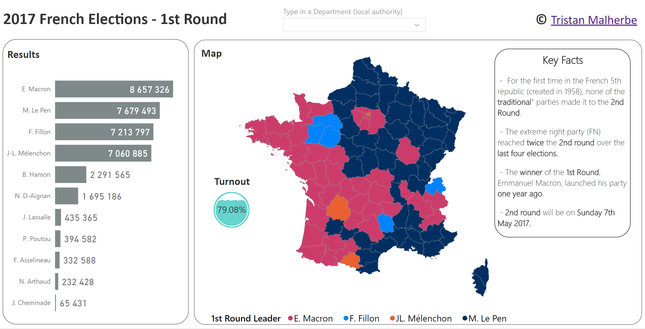
Hello everyone,
I analysed all the presidential elections of the French 5th Republic (1965 - present).
You can visualise the results by candidates / departments and turnout for both 1st and 2nd round.
Details about the project & data sources on Page 3.
Enjoy !!
eyJrIjoiOGYxZmYyMzQtYzM1Ni00N2RiLTk4N2QtZWI5ZDBhMDg5NjZlIiwidCI6IjBlMjhjNjY1LTFkZjctNDhmNi1iNjZlLTIyZmJhNWE5M2Y0YiJ9
- Mark as New
- Bookmark
- Subscribe
- Mute
- Subscribe to RSS Feed
- Permalink
- Report Inappropriate Content
- Mark as New
- Bookmark
- Subscribe
- Mute
- Subscribe to RSS Feed
- Permalink
- Report Inappropriate Content
What is the name of the app you used on the turnout?
- Mark as New
- Bookmark
- Subscribe
- Mute
- Subscribe to RSS Feed
- Permalink
- Report Inappropriate Content
Hello Excelside,
Very neat presentation. I love that you are using white background and I'd like to know how did you make the map background white with only performance colors on the map together with addition of this water lever kpi.
I have attached the map.
Thank you!
PBI user.
- Mark as New
- Bookmark
- Subscribe
- Mute
- Subscribe to RSS Feed
- Permalink
- Report Inappropriate Content
- Mark as New
- Bookmark
- Subscribe
- Mute
- Subscribe to RSS Feed
- Permalink
- Report Inappropriate Content
Hey @Datatouille,
How did you get the map of France to show up by itself (and with districts) and be reactive? I would like to have a map of a state in the US and be able to click on counties to filter data.
- Mark as New
- Bookmark
- Subscribe
- Mute
- Subscribe to RSS Feed
- Permalink
- Report Inappropriate Content
Hi @Anonymous
I am using a custom shape map. Have a look at this article !
Also, have a look at the new choropoleth custom visuals and this video from Pragmatic Works to see how it works.
- Mark as New
- Bookmark
- Subscribe
- Mute
- Subscribe to RSS Feed
- Permalink
- Report Inappropriate Content
Impressive !
very nice dashboard
- Mark as New
- Bookmark
- Subscribe
- Mute
- Subscribe to RSS Feed
- Permalink
- Report Inappropriate Content
Hi,
What visual is used to make prezident pictures to appear based on slicer selection? Is it some special visual, or one of the standards utilised in some clever way?
- Mark as New
- Bookmark
- Subscribe
- Mute
- Subscribe to RSS Feed
- Permalink
- Report Inappropriate Content
Hi @Domantas,
I don't know exactly his using visual, but you could use chiclet slicer visual to achieve that https://app.powerbi.com/visuals/show/ChicletSlicer1448559807354
- Mark as New
- Bookmark
- Subscribe
- Mute
- Subscribe to RSS Feed
- Permalink
- Report Inappropriate Content
Indeed, I am using chiclet slicer ! I could have used Image Viewer custom visual as well.
- Mark as New
- Bookmark
- Subscribe
- Mute
- Subscribe to RSS Feed
- Permalink
- Report Inappropriate Content
Hi @Datatouille,
Your story is very clear with impressive layout. I like the way you used custom visual like chicklet slicer to ensure single selection and liquid fill gauge to show kpi number. but i got a little bit difficult with smart filter in Safari cause some actions seem not working. Anyway, i like this layout and learned much things from your sharing. Hope you could share your pbix in this topic so everyone could refer your design in working.