- Power BI forums
- Updates
- News & Announcements
- Get Help with Power BI
- Desktop
- Service
- Report Server
- Power Query
- Mobile Apps
- Developer
- DAX Commands and Tips
- Custom Visuals Development Discussion
- Health and Life Sciences
- Power BI Spanish forums
- Translated Spanish Desktop
- Power Platform Integration - Better Together!
- Power Platform Integrations (Read-only)
- Power Platform and Dynamics 365 Integrations (Read-only)
- Training and Consulting
- Instructor Led Training
- Dashboard in a Day for Women, by Women
- Galleries
- Community Connections & How-To Videos
- COVID-19 Data Stories Gallery
- Themes Gallery
- Data Stories Gallery
- R Script Showcase
- Webinars and Video Gallery
- Quick Measures Gallery
- 2021 MSBizAppsSummit Gallery
- 2020 MSBizAppsSummit Gallery
- 2019 MSBizAppsSummit Gallery
- Events
- Ideas
- Custom Visuals Ideas
- Issues
- Issues
- Events
- Upcoming Events
- Community Blog
- Power BI Community Blog
- Custom Visuals Community Blog
- Community Support
- Community Accounts & Registration
- Using the Community
- Community Feedback
Register now to learn Fabric in free live sessions led by the best Microsoft experts. From Apr 16 to May 9, in English and Spanish.
- Power BI forums
- Galleries
- Data Stories Gallery
- Baseball Standings Year to Year
Baseball Standings Year to Year
05-05-2017 16:07 PM - last edited 05-06-2017 13:20 PM


- Mark as New
- Bookmark
- Subscribe
- Mute
- Subscribe to RSS Feed
- Permalink
- Report Inappropriate Content
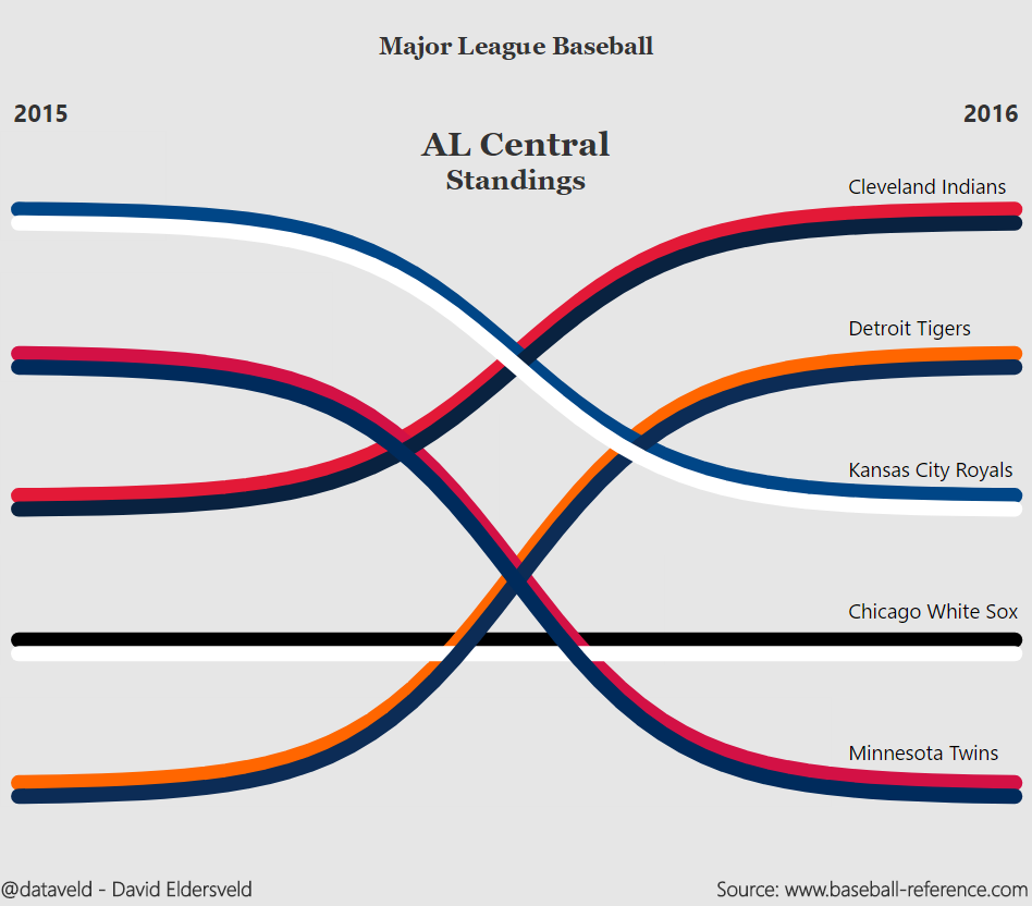
Baseball Standings Year to Year
Visualizes the change in team standings between 2015 and 2016 for Major League Baseball's American League Central division. This visualization showcases the use of the sigmoid function to create curves. More detail in my blog post here: https://dataveld.wordpress.com/2017/05/06/throwing-a-curve-at-the-power-bi-line-chart/
eyJrIjoiYjQyZmI3ZWUtZGJmMi00ZWQ5LTkzZjUtMWIwMTBhNzBhNDZkIiwidCI6IjRlZmE3NzhmLTVmNmMtNDAxZS04OGFmLWNmMTliZDA5ZDE0OCIsImMiOjN9