Join us at the 2025 Microsoft Fabric Community Conference
Microsoft Fabric Community Conference 2025, March 31 - April 2, Las Vegas, Nevada. Use code FABINSIDER for a $400 discount.
Register now- Power BI forums
- Get Help with Power BI
- Desktop
- Service
- Report Server
- Power Query
- Mobile Apps
- Developer
- DAX Commands and Tips
- Custom Visuals Development Discussion
- Health and Life Sciences
- Power BI Spanish forums
- Translated Spanish Desktop
- Training and Consulting
- Instructor Led Training
- Dashboard in a Day for Women, by Women
- Galleries
- Webinars and Video Gallery
- Data Stories Gallery
- Themes Gallery
- Power BI DataViz World Championships Gallery
- Quick Measures Gallery
- R Script Showcase
- COVID-19 Data Stories Gallery
- Community Connections & How-To Videos
- 2021 MSBizAppsSummit Gallery
- 2020 MSBizAppsSummit Gallery
- 2019 MSBizAppsSummit Gallery
- Events
- Ideas
- Custom Visuals Ideas (read-only)
- Issues
- Issues
- Events
- Upcoming Events
The Power BI DataViz World Championships are on! With four chances to enter, you could win a spot in the LIVE Grand Finale in Las Vegas. Show off your skills.
- Power BI forums
- Galleries
- Data Stories Gallery
- Analysis of supplies and sales
- Mark as New
- Bookmark
- Subscribe
- Mute
- Subscribe to RSS Feed
- Permalink
- Report Inappropriate Content
Analysis of supplies and sales
You are provided with 10 screens for analyzing the turnover of Assol products. In the analysis, the following goals were pursued: a general visual assessment of the company's activities, including: the number of deliveries of goods, the rentability of products, the amount of profit from sales in various regions. The goals were also set to determine the ways of the company's future development based on the presented data.
This dashboard is compiled within the framework of the curriculum for general information and does not include confidential information.
The dashboard was compiled by Ekaterina Magadieva, a student of St. Petersburg State Technological University, Faculty of Economics and Management, Business Informatics.
The analysis of the company's activities is very important for the successful existence of the business. Therefore, we have tried to provide all the necessary information for its qualitative assessment.
The following points were presented in the analysis:
- The number of batches for each product name, the total number of batches of products, the average number of batches of products.
- The number of shipments of batches of goods for each region.
- The number of shipments of batches of products for each product category.
- The number of shipments of batches of products by year.
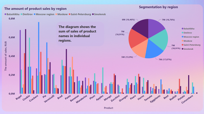
- The amount of product sales for each product name and product group. The total amount from sales.
- The amount of product sales in each region.
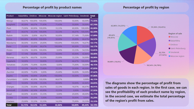
- The percentage of profit from each product name and from each sales region.
- The percentage of profit from each product in a certain region.
With the help of data analysis and visualization, the quantities of deliveries and sales of the company's food products in several regions of the Russian Federation were compared: Moscow, Moscow Region, St. Petersburg, Smolensk, Dmitrov, Balashikha.
Based on the analysis, it can be concluded that the largest deliveries and the largest amount from the sale of goods fall on the city of Dmitrov.
A greater number of deliveries are made for the spaghetti product, but the amount from its sale is lower than the average value for sales of product names. The most profitable category of goods by the number of sales is baking, and the best-selling product is bagels. The highest value for sales of sheep was recorded in Balashikha.
The largest profit comes from the sale of mango (71.43%), and the most profitable region is the city of Moscow (55.56%).
Thus, the company can make a choice in favor of increasing the supply of pastries and mangoes, as well as expanding its activities in the cities of Dmitrov, Balashikha and Moscow.
eyJrIjoiNGM2ZTM1ZDgtOGFiYi00NDA3LWI2YjEtMTEwMmM0OTE4MzI4IiwidCI6IjZiZTgxZjIwLWFlY2MtNGQyZC1hMTM0LWJmZWJlOTAxODE4NCIsImMiOjl9
____________
⭐️ Fabric Group Channel
⭐️ Microsoft Fabric Community
Please join the Power BI UX/UI User Group if you need help with dashboard design and usability
Join to Data Governance User Group
Join to DENEB and Power BI Enthusiasts User Group
Join to Data Fabric Best Practices User Group
Subscribe to my medium blog
- Mark as New
- Bookmark
- Subscribe
- Mute
- Subscribe to RSS Feed
- Permalink
- Report Inappropriate Content
Interesting colors have been selected for the dashboard. But the information in the table on picture 9 is hard to read
- Mark as New
- Bookmark
- Subscribe
- Mute
- Subscribe to RSS Feed
- Permalink
- Report Inappropriate Content
Imo, the color of the graphs is a little sharp, but the design is still very nice!
- Mark as New
- Bookmark
- Subscribe
- Mute
- Subscribe to RSS Feed
- Permalink
- Report Inappropriate Content
Very interesting design, it allows you to look at the problem from a different angle
- Mark as New
- Bookmark
- Subscribe
- Mute
- Subscribe to RSS Feed
- Permalink
- Report Inappropriate Content
In my opinion, everything is done perfectly!
- Mark as New
- Bookmark
- Subscribe
- Mute
- Subscribe to RSS Feed
- Permalink
- Report Inappropriate Content
Visualization colors are well chosen. And the information table is available for understanding
- Mark as New
- Bookmark
- Subscribe
- Mute
- Subscribe to RSS Feed
- Permalink
- Report Inappropriate Content
А very informative dashboard. Good job!!!
- Mark as New
- Bookmark
- Subscribe
- Mute
- Subscribe to RSS Feed
- Permalink
- Report Inappropriate Content
I like the color scheme, very stylish
- Mark as New
- Bookmark
- Subscribe
- Mute
- Subscribe to RSS Feed
- Permalink
- Report Inappropriate Content
Such a view is not focused on immediate action. Its main purpose is to help users better understand data, analyze trends and make decisions. Good job!
- Mark as New
- Bookmark
- Subscribe
- Mute
- Subscribe to RSS Feed
- Permalink
- Report Inappropriate Content
Nice dashboard, but it's hard to read the conclusion due to picture on the background
- Mark as New
- Bookmark
- Subscribe
- Mute
- Subscribe to RSS Feed
- Permalink
- Report Inappropriate Content
When visualizing "Product sales volume in each region", it is difficult to perceive the data, there is not enough filter
- Mark as New
- Bookmark
- Subscribe
- Mute
- Subscribe to RSS Feed
- Permalink
- Report Inappropriate Content
Beautiful design!


