- Power BI forums
- Updates
- News & Announcements
- Get Help with Power BI
- Desktop
- Service
- Report Server
- Power Query
- Mobile Apps
- Developer
- DAX Commands and Tips
- Custom Visuals Development Discussion
- Health and Life Sciences
- Power BI Spanish forums
- Translated Spanish Desktop
- Power Platform Integration - Better Together!
- Power Platform Integrations (Read-only)
- Power Platform and Dynamics 365 Integrations (Read-only)
- Training and Consulting
- Instructor Led Training
- Dashboard in a Day for Women, by Women
- Galleries
- Community Connections & How-To Videos
- COVID-19 Data Stories Gallery
- Themes Gallery
- Data Stories Gallery
- R Script Showcase
- Webinars and Video Gallery
- Quick Measures Gallery
- 2021 MSBizAppsSummit Gallery
- 2020 MSBizAppsSummit Gallery
- 2019 MSBizAppsSummit Gallery
- Events
- Ideas
- Custom Visuals Ideas
- Issues
- Issues
- Events
- Upcoming Events
- Community Blog
- Power BI Community Blog
- Custom Visuals Community Blog
- Community Support
- Community Accounts & Registration
- Using the Community
- Community Feedback
Register now to learn Fabric in free live sessions led by the best Microsoft experts. From Apr 16 to May 9, in English and Spanish.
- Power BI forums
- Galleries
- Data Stories Gallery
- A Glimpse into Michigan's Children in Poverty


- Mark as New
- Bookmark
- Subscribe
- Mute
- Subscribe to RSS Feed
- Permalink
- Report Inappropriate Content
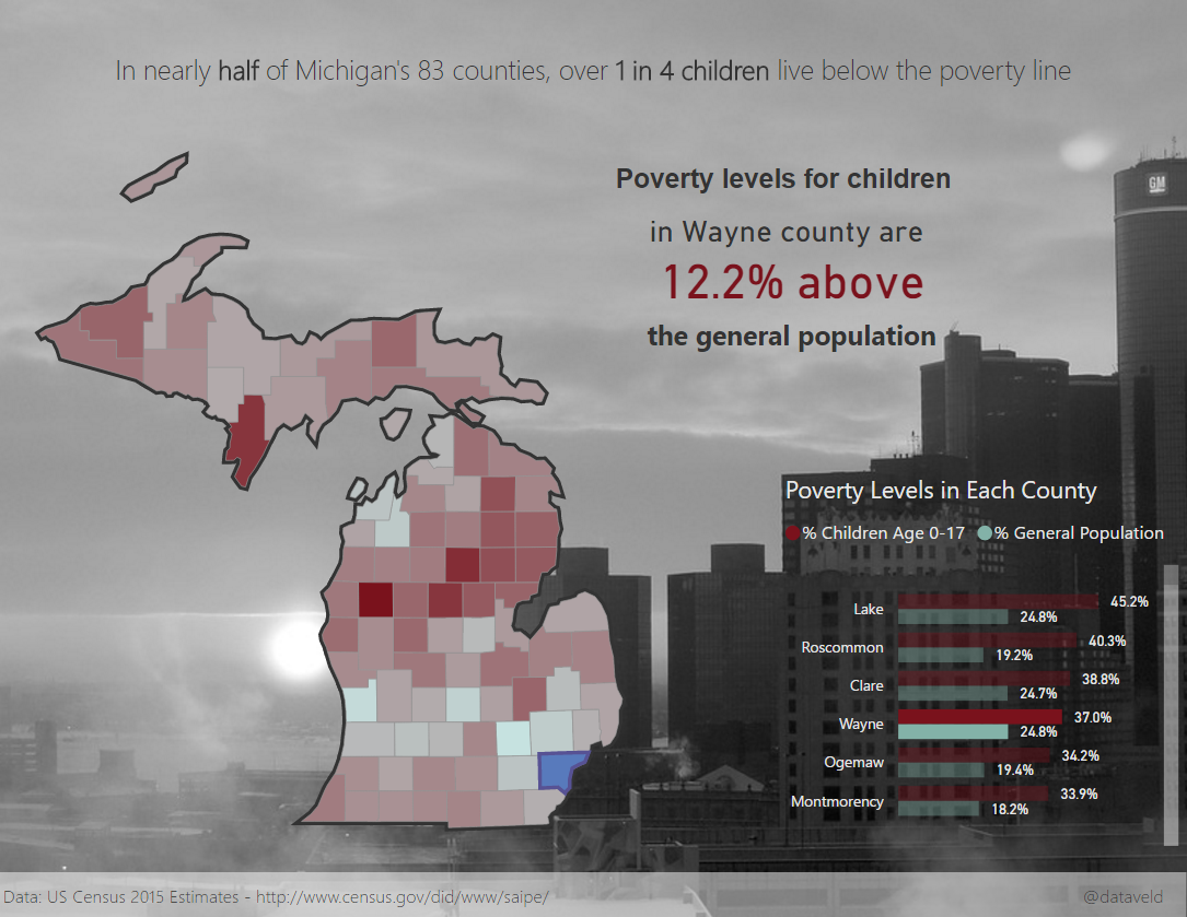
A Glimpse into Michigan's Children in Poverty
I created this report after seeing a list of local youth service organizations published by the Detroit Free Press. It features simple visualizations based on US Census data from 2015. One unique feature is a Shape Map county "highlight" effect achieved by layering maps. Also uses a custom Shape Map showing the concentration of poverty in Detroit and how it falls on the services of only one public school district to work with the majority of children who are under the poverty line.
Data: http://www.census.gov/did/www/saipe
eyJrIjoiZTdhN2RkZjYtZjBiOC00OGJjLWI4NWYtMWQyOTAzNjg3MWU5IiwidCI6IjRlZmE3NzhmLTVmNmMtNDAxZS04OGFmLWNmMTliZDA5ZDE0OCIsImMiOjN9
- Mark as New
- Bookmark
- Subscribe
- Mute
- Subscribe to RSS Feed
- Permalink
- Report Inappropriate Content
Looks great! What DAX did you use to determine if one or more than one county were selected?
- Mark as New
- Bookmark
- Subscribe
- Mute
- Subscribe to RSS Feed
- Permalink
- Report Inappropriate Content
IF(HASONEVALUE('Poverty Data 2015'[County]), ..., ...)
- Mark as New
- Bookmark
- Subscribe
- Mute
- Subscribe to RSS Feed
- Permalink
- Report Inappropriate Content
Thanks, @deldersveld! Any chance you might post the full syntax? I am trying to translate years of Excel dev into DAX and I am not clear on how to get the filter context and to pass in a text value. So this hits two needs. Much appreciated!
Scott
- Mark as New
- Bookmark
- Subscribe
- Mute
- Subscribe to RSS Feed
- Permalink
- Report Inappropriate Content
The report looks great.
How did you manage to get Counties? I was looking to create a report by county but was not able to do it.
- Mark as New
- Bookmark
- Subscribe
- Mute
- Subscribe to RSS Feed
- Permalink
- Report Inappropriate Content
Thanks! I have a collection of topojson files that includes counties for all US states. There is no county map currently available out of the box for the Shape Map, so you have to use a separate file. Here's a link to my blog post with more detail on what's available as well as the direct link to all of the topojson files:
https://dataveld.wordpress.com/2016/09/12/topojson-map-files-for-power-bi-shape-map/
- Mark as New
- Bookmark
- Subscribe
- Mute
- Subscribe to RSS Feed
- Permalink
- Report Inappropriate Content
Thank you!