New Offer! Become a Certified Fabric Data Engineer
Check your eligibility for this 50% exam voucher offer and join us for free live learning sessions to get prepared for Exam DP-700.
Get Started- Power BI forums
- Get Help with Power BI
- Desktop
- Service
- Report Server
- Power Query
- Mobile Apps
- Developer
- DAX Commands and Tips
- Custom Visuals Development Discussion
- Health and Life Sciences
- Power BI Spanish forums
- Translated Spanish Desktop
- Training and Consulting
- Instructor Led Training
- Dashboard in a Day for Women, by Women
- Galleries
- Community Connections & How-To Videos
- COVID-19 Data Stories Gallery
- Themes Gallery
- Data Stories Gallery
- R Script Showcase
- Webinars and Video Gallery
- Quick Measures Gallery
- 2021 MSBizAppsSummit Gallery
- 2020 MSBizAppsSummit Gallery
- 2019 MSBizAppsSummit Gallery
- Events
- Ideas
- Custom Visuals Ideas
- Issues
- Issues
- Events
- Upcoming Events
Don't miss out! 2025 Microsoft Fabric Community Conference, March 31 - April 2, Las Vegas, Nevada. Use code MSCUST for a $150 discount. Prices go up February 11th. Register now.
- Power BI forums
- Galleries
- Data Stories Gallery
- 2 Pages Football interactive and animation V1 - Pr...
2 Pages Football interactive and animation V1 - Proof Of Concept
07-24-2022 05:10 AM - last edited 02-19-2023 17:25 PM
- Mark as New
- Bookmark
- Subscribe
- Mute
- Subscribe to RSS Feed
- Permalink
- Report Inappropriate Content
2 Pages Football interactive and animation V1 - Proof Of Concept
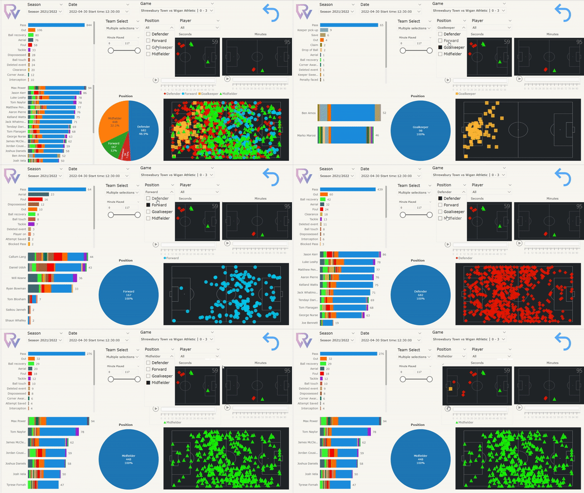
All element in the dashboard is interactive. E.g. click on any plot and it will point all relevant information to it.
Page 1) Showing team stats within a game. You can hold ctrl on team select if want to visualise both teams at once. Minute played silder is useful if you want to visualise a particular timeframe within a game. Two mini scatter plots with individual seconds/min for animation.
Page 2) This is an animation to visualise a pass between each player
There may be some delay in performance as i haven't optimize fully yet but the main purpose is to demonstrate that it's possible to analyse further stats within sports analytics.
eyJrIjoiNzgwOTA3NTAtZjBmZS00NGYxLWE3MDMtOTg0NjhkMmMwNzBhIiwidCI6Ijc4ZGE4MTJlLTkxMjgtNGY1NC04NzUzLTg0YWYwZmY4N2FjMyJ9
- Mark as New
- Bookmark
- Subscribe
- Mute
- Subscribe to RSS Feed
- Permalink
- Report Inappropriate Content
Hello.
Congratulations on the dashboard.
I live in Brazil.
I would like to know how you made these animated graphics.
- Mark as New
- Bookmark
- Subscribe
- Mute
- Subscribe to RSS Feed
- Permalink
- Report Inappropriate Content
Hello there! Please kindly check out my blog where I have covered it in great detail. Thanks!
https://community.powerbi.com/t5/Community-Blog/Advanced-Sport-Visualisations-in-Power-BI/ba-p/26651...


