- Power BI forums
- Updates
- News & Announcements
- Get Help with Power BI
- Desktop
- Service
- Report Server
- Power Query
- Mobile Apps
- Developer
- DAX Commands and Tips
- Custom Visuals Development Discussion
- Health and Life Sciences
- Power BI Spanish forums
- Translated Spanish Desktop
- Power Platform Integration - Better Together!
- Power Platform Integrations (Read-only)
- Power Platform and Dynamics 365 Integrations (Read-only)
- Training and Consulting
- Instructor Led Training
- Dashboard in a Day for Women, by Women
- Galleries
- Community Connections & How-To Videos
- COVID-19 Data Stories Gallery
- Themes Gallery
- Data Stories Gallery
- R Script Showcase
- Webinars and Video Gallery
- Quick Measures Gallery
- 2021 MSBizAppsSummit Gallery
- 2020 MSBizAppsSummit Gallery
- 2019 MSBizAppsSummit Gallery
- Events
- Ideas
- Custom Visuals Ideas
- Issues
- Issues
- Events
- Upcoming Events
- Community Blog
- Power BI Community Blog
- Custom Visuals Community Blog
- Community Support
- Community Accounts & Registration
- Using the Community
- Community Feedback
Register now to learn Fabric in free live sessions led by the best Microsoft experts. From Apr 16 to May 9, in English and Spanish.
- Power BI forums
- Forums
- Get Help with Power BI
- DAX Commands and Tips
- Using different columns for measure depening on us...
- Subscribe to RSS Feed
- Mark Topic as New
- Mark Topic as Read
- Float this Topic for Current User
- Bookmark
- Subscribe
- Printer Friendly Page
- Mark as New
- Bookmark
- Subscribe
- Mute
- Subscribe to RSS Feed
- Permalink
- Report Inappropriate Content
Using different columns for measure depening on user selection in excel pivot table
Hi,
I am still a beginner but I have the following use case and I am not sure if and how it is possible to set it up:
Let's say I have the following table:
| Actual Revenue | Plan Revenue | |
| Project A | 10 | 9 |
| Project B | 8 | 9 |
| Project C | 5 | 5 |
I have then added a measure that calculates the Actual vs Plan percentage.
Our users are not really interacting with the dataset in Power BI directly, but instead in Excel through Data -> Get Data -> From Power Platform -> From Power BI as a pivot table.
But now we have an addition of a second plan. So the table is now:
| Actual Revenue | Plan 1 Revenue | Plan 2 Revenue | |
| Project A | 10 | 9 | 13 |
| Project B | 8 | 9 | 11 |
| Project C | 5 | 5 | 3 |
Ideally, I would like to avoid having 2 separate measures like Actual vs Plan 1 and Actual vs Plan 2, and just have one measure, using the Plan value based on the users, if he wants to use Plan 1 or Plan 2.
Is there a way to do this, so the user can use it in excel's pivot tables as well?
Thanks!
Solved! Go to Solution.
- Mark as New
- Bookmark
- Subscribe
- Mute
- Subscribe to RSS Feed
- Permalink
- Report Inappropriate Content
Hi @Hambach ,
According to your description, here are my steps you can follow as a solution.
(1) My test data is the same as yours.
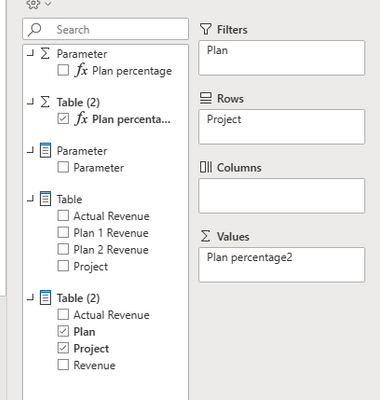
(2) Select the [Plan 1 Revenue] column and the [Plan 2 Revenue] column in the power query editor to transpose.
(3)We can create a measure.
Plan percentage =
DIVIDE(SUM('Table'[Revenue]),SUM('Table'[Actual Revenue]),0)
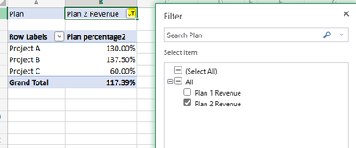
(4) Filter the [Plan] field in the pivot tables.
Best Regards,
Neeko Tang
If this post helps, then please consider Accept it as the solution to help the other members find it more quickly.
- Mark as New
- Bookmark
- Subscribe
- Mute
- Subscribe to RSS Feed
- Permalink
- Report Inappropriate Content
hi @Hambach
you shall know a power feature called field parameter, with which the user could decide which measure to plot in a visual. But it works only on Power BI.
https://learn.microsoft.com/en-us/power-bi/create-reports/power-bi-field-parameters
Helpful resources

Microsoft Fabric Learn Together
Covering the world! 9:00-10:30 AM Sydney, 4:00-5:30 PM CET (Paris/Berlin), 7:00-8:30 PM Mexico City

Power BI Monthly Update - April 2024
Check out the April 2024 Power BI update to learn about new features.

| User | Count |
|---|---|
| 40 | |
| 27 | |
| 20 | |
| 14 | |
| 8 |
| User | Count |
|---|---|
| 76 | |
| 48 | |
| 46 | |
| 20 | |
| 16 |


