FabCon is coming to Atlanta
Join us at FabCon Atlanta from March 16 - 20, 2026, for the ultimate Fabric, Power BI, AI and SQL community-led event. Save $200 with code FABCOMM.
Register now!- Power BI forums
- Get Help with Power BI
- Desktop
- Service
- Report Server
- Power Query
- Mobile Apps
- Developer
- DAX Commands and Tips
- Custom Visuals Development Discussion
- Health and Life Sciences
- Power BI Spanish forums
- Translated Spanish Desktop
- Training and Consulting
- Instructor Led Training
- Dashboard in a Day for Women, by Women
- Galleries
- Data Stories Gallery
- Themes Gallery
- Contests Gallery
- QuickViz Gallery
- Quick Measures Gallery
- Visual Calculations Gallery
- Notebook Gallery
- Translytical Task Flow Gallery
- TMDL Gallery
- R Script Showcase
- Webinars and Video Gallery
- Ideas
- Custom Visuals Ideas (read-only)
- Issues
- Issues
- Events
- Upcoming Events
The Power BI Data Visualization World Championships is back! Get ahead of the game and start preparing now! Learn more
- Power BI forums
- Forums
- Get Help with Power BI
- DAX Commands and Tips
- Re: Graph months in wrong order
- Subscribe to RSS Feed
- Mark Topic as New
- Mark Topic as Read
- Float this Topic for Current User
- Bookmark
- Subscribe
- Printer Friendly Page


- Mark as New
- Bookmark
- Subscribe
- Mute
- Subscribe to RSS Feed
- Permalink
- Report Inappropriate Content
Graph months in wrong order
Hi,
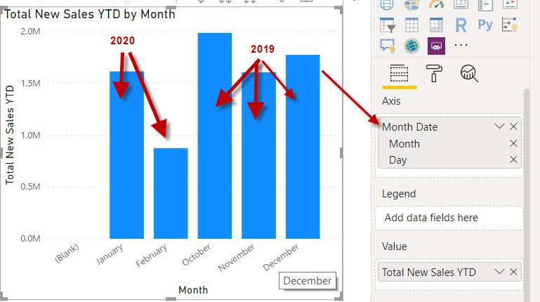
I am trying to create a graph of YTD sales. The tricky part is our year starts on the 1st of October - if i plot the graph it show January 2020 as the first bar instead of October 2019? I am using the date heirachy as on the X-axis also? The date format is DD/MM/YYYY if that is required also?
Can anyone point me in the right direction so the graph starts with Oct 2019, Dec 2019, Jan 2020, Feb 2020 etc etc?
Solved! Go to Solution.
- Mark as New
- Bookmark
- Subscribe
- Mute
- Subscribe to RSS Feed
- Permalink
- Report Inappropriate Content
Ah, so if you click on your visual as is, there is the "Expand" button in the tooltips (upper right-hand corner). It looks like an upside down fieldgoal. Click that and then you'll see the additional details.


- Mark as New
- Bookmark
- Subscribe
- Mute
- Subscribe to RSS Feed
- Permalink
- Report Inappropriate Content
Sounds like you need a Sort By column for your Month Date.
Follow on LinkedIn
@ me in replies or I'll lose your thread!!!
Instead of a Kudo, please vote for this idea
Become an expert!: Enterprise DNA
External Tools: MSHGQM
YouTube Channel!: Microsoft Hates Greg
Latest book!: DAX For Humans
DAX is easy, CALCULATE makes DAX hard...

- Mark as New
- Bookmark
- Subscribe
- Mute
- Subscribe to RSS Feed
- Permalink
- Report Inappropriate Content
Hi @JamesGordon ,
You'll want to format your field as the whole date rather than the date hierarchy.
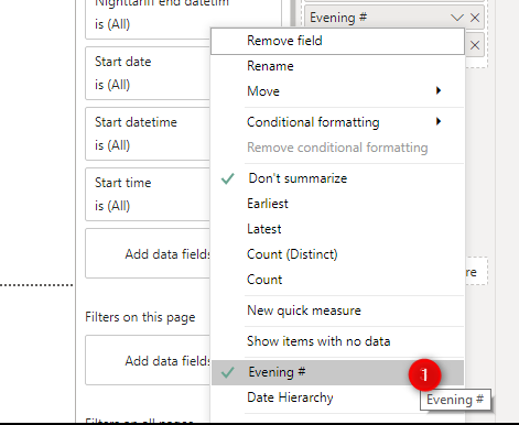
From there, you can format the date field to just be Month name, Year or even Month name and it'll work sequentially.
- Paul
- Mark as New
- Bookmark
- Subscribe
- Mute
- Subscribe to RSS Feed
- Permalink
- Report Inappropriate Content
Thanks Paul,
I have chosen to display by Date instead of hierarchy so all in the correct order now- thank you!
I cant see any option to format the date field to just be Month name? I have looked in the format tab as highligted below - or am i looking in the wrong area?

- Mark as New
- Bookmark
- Subscribe
- Mute
- Subscribe to RSS Feed
- Permalink
- Report Inappropriate Content
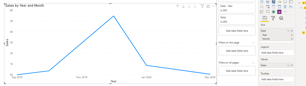
Thinking about it some more, why not just include the year in your original visual (with the full date hierarchy)? If you're doing a YTD calculation, you could always just drop months that =0 or only show the last 12 months.
- Mark as New
- Bookmark
- Subscribe
- Mute
- Subscribe to RSS Feed
- Permalink
- Report Inappropriate Content
Hi Paul,
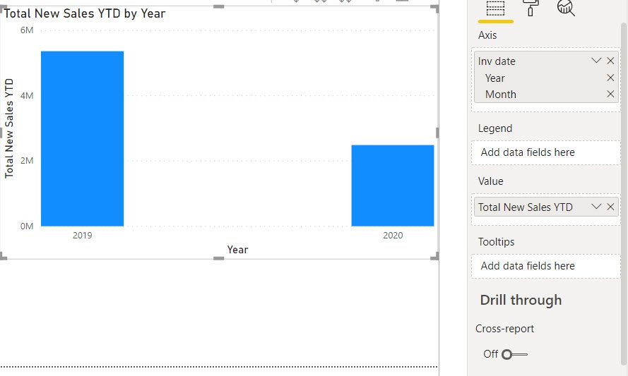
This is what the graph produces if i choose year and month - doesnt appear to break it down any further unless i select only "month" but then it arranges the month in the order as per my orginal post?
- Mark as New
- Bookmark
- Subscribe
- Mute
- Subscribe to RSS Feed
- Permalink
- Report Inappropriate Content
Ah, so if you click on your visual as is, there is the "Expand" button in the tooltips (upper right-hand corner). It looks like an upside down fieldgoal. Click that and then you'll see the additional details.
- Mark as New
- Bookmark
- Subscribe
- Mute
- Subscribe to RSS Feed
- Permalink
- Report Inappropriate Content
Ah ha, that worked - Thank you!
As a side note - would you know how to calculate these sales to prodice a cumulative month to month graph also?
- Mark as New
- Bookmark
- Subscribe
- Mute
- Subscribe to RSS Feed
- Permalink
- Report Inappropriate Content
Haha, no worries!
Yeah, you want to have a calculated column where it sums all values less than or equal to the current date. You could even set a "start" point if you only ever wanted the last rolling 12.
Here's another solution that does that.
https://community.powerbi.com/t5/Desktop/Cumulative-Total/td-p/43115
Helpful resources

Power BI Dataviz World Championships
The Power BI Data Visualization World Championships is back! Get ahead of the game and start preparing now!

Power BI Monthly Update - December 2025
Check out the December 2025 Power BI Holiday Recap!

FabCon Atlanta 2026
Join us at FabCon Atlanta, March 16-20, for the ultimate Fabric, Power BI, AI and SQL community-led event. Save $200 with code FABCOMM.

| User | Count |
|---|---|
| 9 | |
| 5 | |
| 5 | |
| 3 | |
| 3 |


| User | Count |
|---|---|
| 24 | |
| 11 | |
| 9 | |
| 6 | |
| 6 |


