Fabric Data Days starts November 4th!
Advance your Data & AI career with 50 days of live learning, dataviz contests, hands-on challenges, study groups & certifications and more!
Get registered- Power BI forums
- Get Help with Power BI
- Desktop
- Service
- Report Server
- Power Query
- Mobile Apps
- Developer
- DAX Commands and Tips
- Custom Visuals Development Discussion
- Health and Life Sciences
- Power BI Spanish forums
- Translated Spanish Desktop
- Training and Consulting
- Instructor Led Training
- Dashboard in a Day for Women, by Women
- Galleries
- Data Stories Gallery
- Themes Gallery
- Contests Gallery
- Quick Measures Gallery
- Visual Calculations Gallery
- Notebook Gallery
- Translytical Task Flow Gallery
- TMDL Gallery
- R Script Showcase
- Webinars and Video Gallery
- Ideas
- Custom Visuals Ideas (read-only)
- Issues
- Issues
- Events
- Upcoming Events
Get Fabric Certified for FREE during Fabric Data Days. Don't miss your chance! Learn more
- Power BI forums
- Forums
- Get Help with Power BI
- DAX Commands and Tips
- DAX: Measure to calculate 15-minute averages from ...
- Subscribe to RSS Feed
- Mark Topic as New
- Mark Topic as Read
- Float this Topic for Current User
- Bookmark
- Subscribe
- Printer Friendly Page
- Mark as New
- Bookmark
- Subscribe
- Mute
- Subscribe to RSS Feed
- Permalink
- Report Inappropriate Content
DAX: Measure to calculate 15-minute averages from one-minute data
I have one-minute data in a table. This is a lot of data points to put on a time-series line chart. I am looking to take my one-minute data and calculate a measure to roll up the values into 15-minute averages, and then show those values on a line chart visual instead of the original data. I am looking for a DAX formula that will take my one-minute data and calculate 15-minute averages to put on a chart.
I am looking at a solution like the following message, but I don't know how to roll up into 15-minutes.
https://community.powerbi.com/t5/Desktop/calculate-average-of-a-measure/m-p/297565#M131310
If it helps, I already have a table with a column of 15-minute containers for my data. For example, for the 15 minute rows between 11:00 and 11:14, I have another column with a value of 11:00. Likewise, for 11:15 to 11:29, I have a value of 11:15. Can I group by and average by that column? I am confused by the uses of AVERAGEX, SUMMARAIZE, GROUPBY, etc.
Thank you!
- Mark as New
- Bookmark
- Subscribe
- Mute
- Subscribe to RSS Feed
- Permalink
- Report Inappropriate Content
Hi,
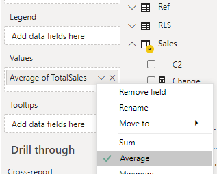
If you use Power BI and use the 15-minute attribute on the axis in the line chart, you could just change the aggregation of the data column to AVERAGE.
Or create a measure like this:
NewMeasure = AVERAGE('Table'[DataColumn])
If you want to for example SUM the 15 minute averages (in the grand total) you could do something like
NewMeasure = SUMX(Values('Table'[15min]), CALCULATE(AVERAGE('Table'[DataColumn]))).
Best Regards
Ulf
Helpful resources

Fabric Data Days
Advance your Data & AI career with 50 days of live learning, contests, hands-on challenges, study groups & certifications and more!

Power BI Monthly Update - October 2025
Check out the October 2025 Power BI update to learn about new features.

| User | Count |
|---|---|
| 8 | |
| 5 | |
| 4 | |
| 3 | |
| 3 |
| User | Count |
|---|---|
| 24 | |
| 12 | |
| 11 | |
| 9 | |
| 8 |

