New Offer! Become a Certified Fabric Data Engineer
Check your eligibility for this 50% exam voucher offer and join us for free live learning sessions to get prepared for Exam DP-700.
Get StartedDon't miss out! 2025 Microsoft Fabric Community Conference, March 31 - April 2, Las Vegas, Nevada. Use code MSCUST for a $150 discount. Prices go up February 11th. Register now.
- Microsoft Fabric Community
- Fabric community blogs
- Power BI Community Blog
- Power BI Challenge - HR Data Analysis
- Subscribe to RSS Feed
- Mark as New
- Mark as Read
- Bookmark
- Subscribe
- Printer Friendly Page
- Report Inappropriate Content
- Subscribe to RSS Feed
- Mark as New
- Mark as Read
- Bookmark
- Subscribe
- Printer Friendly Page
- Report Inappropriate Content
I really enjoyed recently working through the latest Power BI Challenge from Enterprise DNA. This was not an easy scenario that we were dealing with. We had some HR consultation data and the required analysis was quite unique.
You can view the demo showcase here:
But these are the challenges that I love, and it showcases the immense variability and flexibility that you have with the Power BI toolset, most importantly Power BI Desktop.
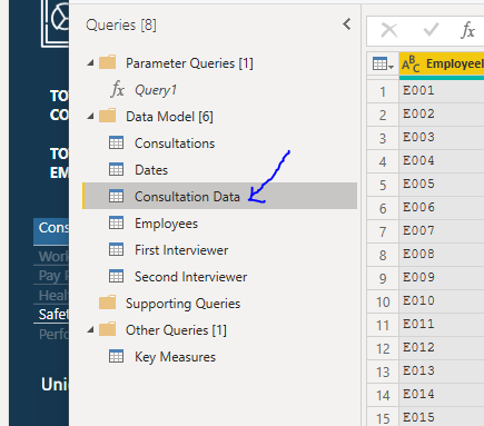
There was a bit of work to do at the Power Query level, where I organized my data model in a way that I could simplify the fact table of the consultation data.
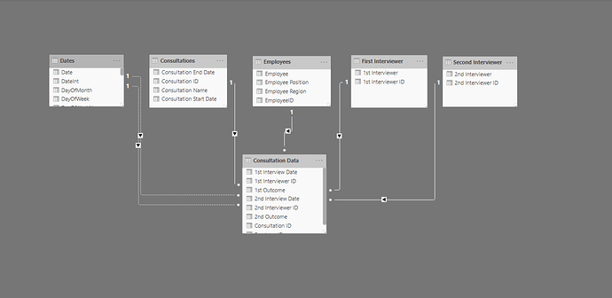
The consultation data started off as our main Excel file, basically our database, and if I wanted to optimize it for Power BI I needed to break it out into more of a shape suited for a data model. This was the waterfall technique that I use frequently with my lookup tables at the top and my fact tables down the bottom.
By doing that, I was able to break out a range of different lookup tables like consultations, interviewers, employees and dates.
It’s always important to deeply consider the ultimate model that you create because my ultimate visualizations would have been impacted significantly if I did not follow this methodology in creating my data model for Power BI.
Interesting with this challenge as well is that I didn’t have to create a huge amount of DAX measures. A big part of the challenge was basically working out how to showcase these insights in an effective way. So, I spent a lot of my time thinking and planning out how this visualization could work and flow for a consumer.
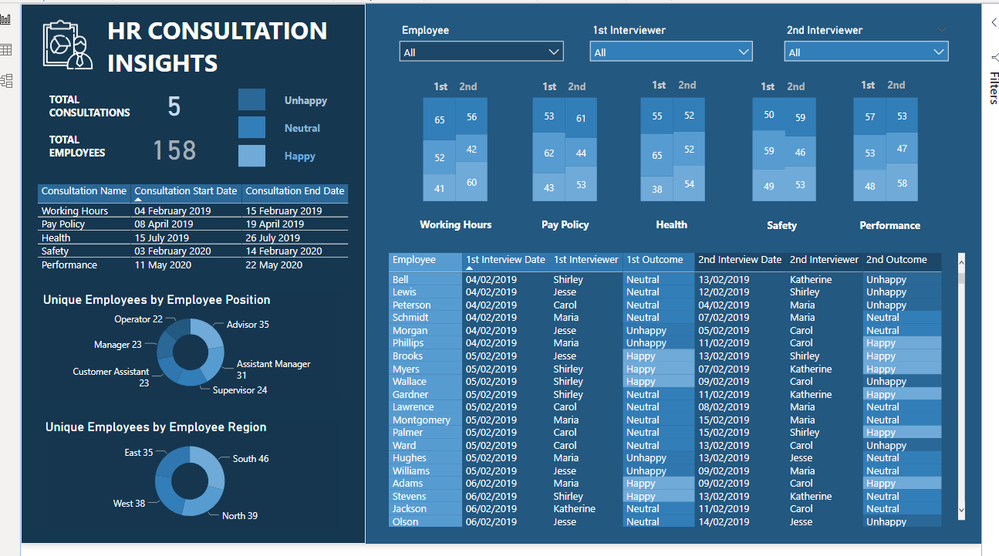
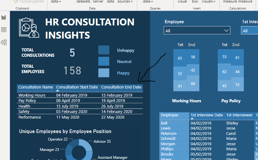
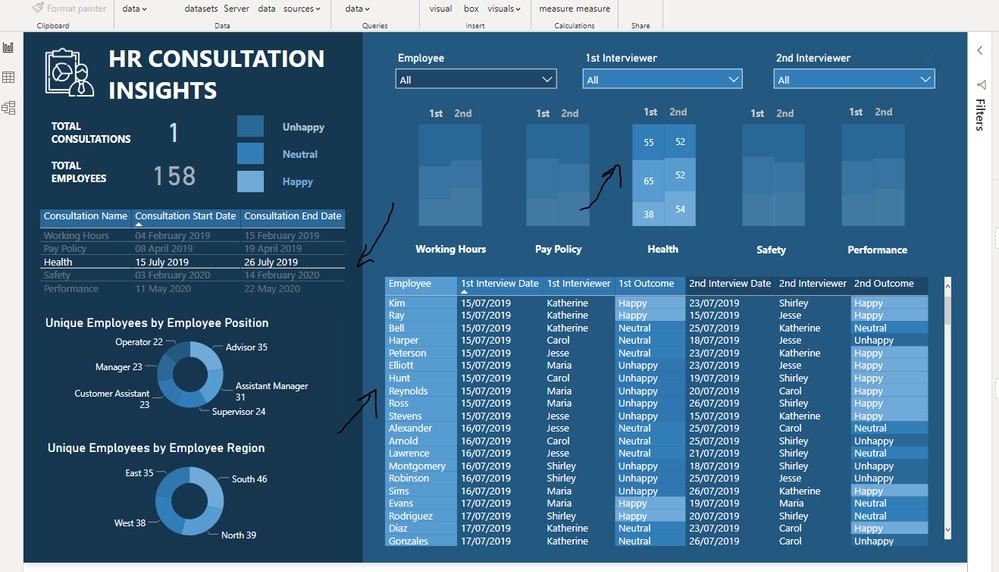
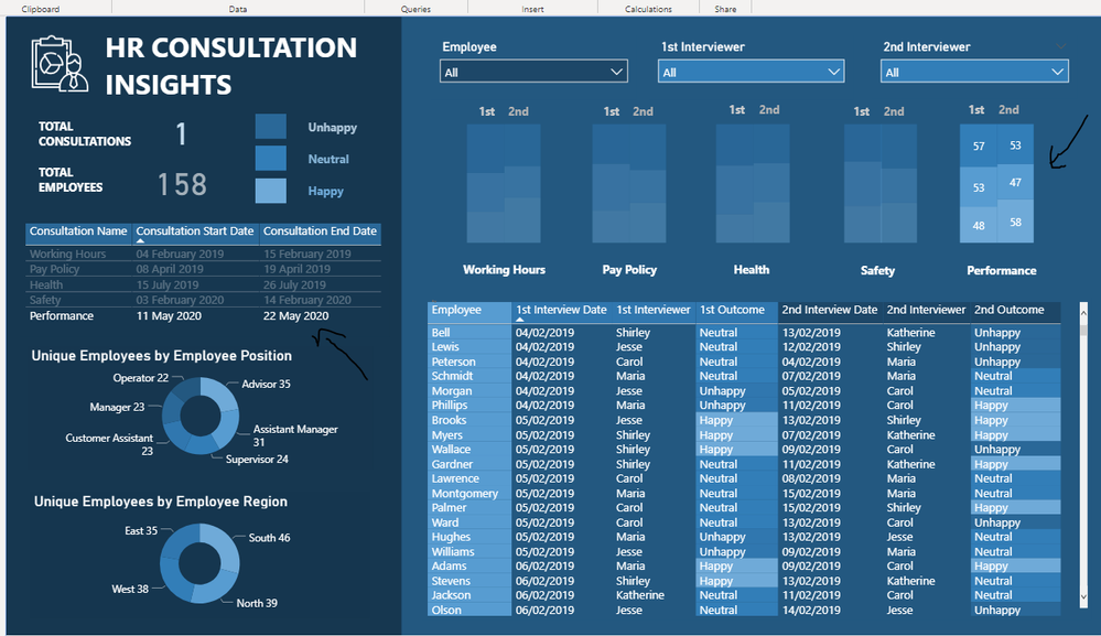
A manager would want to look at this data and be able to see a specific consultation and then see the more specific outcomes of each consultation. So, on the left-hand side I created a simple table listing out each different consultation with its start and end date. Then on the right-hand side I summarized each consultation and the interviews encapsulated within each consultation.
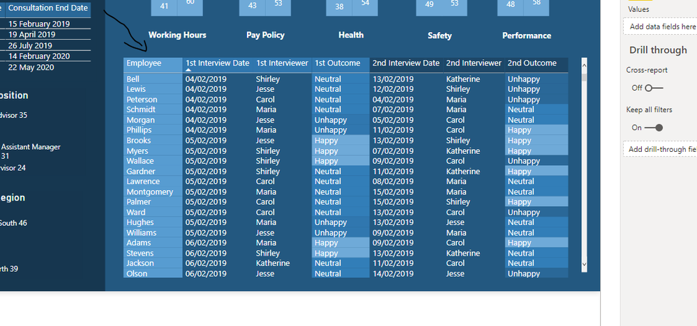
Then we have a more detailed table with all of the granular information for each employee. This would be important for a number of reasons for a manager because they would be able to evaluate how individual employees reacted to each consultation but then also look at the trends for each interviewer.
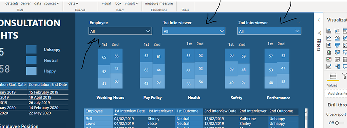
Also, importantly at the top, I created some dropdown slicers which enabled even further filtering of the information on the report page. A big part of understanding how the consultation went was reviewing how each interviewer performed versus how well the employee thought the outcome was of each consultation. I think that this is represented quite well when you are able to filter by one particular employee or for a variety of different interviewers.
I really enjoyed working on this report. As mentioned, it wasn’t actually that difficult from a calculation perspective it was more thinking creatively about how to showcase data in an efficient and effective way for key decision-makers. And sometimes that’s all it really is about. I think sometimes we can look to overcomplicate things when they don’t need to be, and that was a good lesson that I got out of working through this report development.
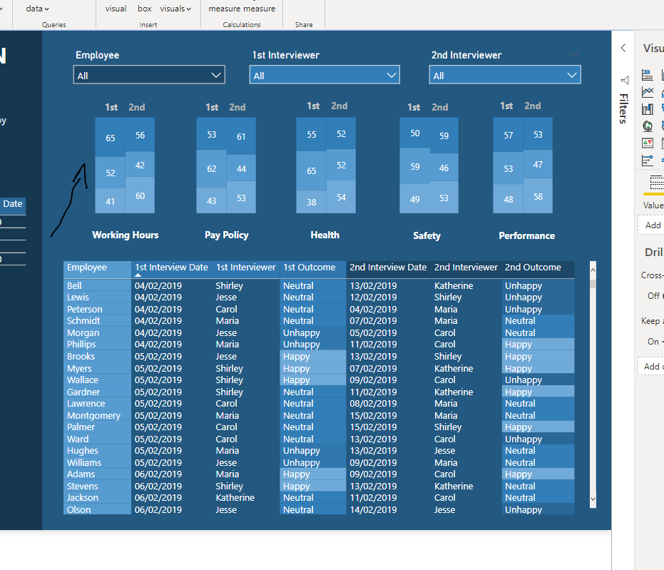
One thing I will also add here is that to create the stacked column visualization… what I did there was I created 2 stacked column charts, removed all of the axis information, title information and legend information. Then brought them both together so that they stood side by side and looked like they were one visual. I then copied and pasted it five times to showcase the differences between interview one and interview two for each different consultation.
It took me a while to work out this visualization technique and I had to actually draw it out, to begin with but once I decided that this was a good way to represent the data I followed through and created this unique visualization for the right hand side of my dashboard.
Hope you liked reviewing how I created this and well done to all the other submissions in the challenge. There really has been some incredible work in Power BI in this challenge and all the other challenges of late.
You can check out our latest Power BI Challenge here: HR Consultation Insights - Power BI Challenge 3
So great to see this after putting in many years now of educating thousands of Power BI users around the world. It’s amazing to see everyone’s development.
All the best.
Sam
***** Learning Power BI? *****
FREE COURSE – Ultimate Beginners Guide To Power BI
FREE COURSE – Ultimate Beginners Guide To DAX
FREE – 60 Page DAX Reference Guide Download
FREE – Power BI Resource
Enterprise DNA Membership
Enterprise DNA Online
Enterprise DNA Events
***** Related Links *****
Power BI Challenges
Power BI Challenge 1
Power BI Challenge 1 - Wrap Up
Power BI Challenge 2
Power BI Challenge 2 - Wrap Up
You must be a registered user to add a comment. If you've already registered, sign in. Otherwise, register and sign in.
- Microsoft Fabric: Implementing Version Control for...
- How to show slicer selected values in Power BI Rep...
- Optimizing Direct Lake Mode in Microsoft Fabric: A...
- Host Fabric capacity workspaces with premium items...
- Import Multiple Excel Files in Power BI
- ALL, ALL SELECTED and ALL EXCEPT
- Custom Data Labels in Power BI
- Token-based pagination In Power Query
- NEW OFFER! Discount Certification Voucher - Fabric...
- Boosting Sales and Customer Satisfaction: The Powe...
- andyai on: Microsoft Fabric: Implementing Version Control for...
-
_MMahmood_
 on:
Token-based pagination In Power Query
- Abdurahman on: NEW OFFER! Discount Certification Voucher - Fabric...
- Zarina on: Boosting Sales and Customer Satisfaction: The Powe...
-
 danextian
on:
SVG based Power BI Semantic Model Columns and Meas...
- Zainul0101 on: Microsoft Power BI vs Microsoft Fabric
-
 saud968
on:
Introducing the new text slicer in Power BI
- akhillamcor on: Explore Small Multiples for the New Card Visual in...
- Nazrin on: Mastering Dynamic Stock Management with Cumulative...
-
 Icaro_Bonfim
on:
Power BI Export All Visuals - python notebook
-
How to
632 -
Tips & Tricks
599 -
Support insights
121 -
Events
111 -
Opinion
75 -
DAX
66 -
Power BI
65 -
Power Query
62 -
Power BI Dev Camp
45 -
Power BI Desktop
40 -
Roundup
36 -
Power BI Embedded
20 -
Time Intelligence
19 -
Tips&Tricks
18 -
Featured User Group Leader
13 -
PowerBI REST API
12 -
Power Query Tips & Tricks
8 -
finance
8 -
Power BI Service
8 -
Dataflow
7 -
Direct Query
7 -
Power BI REST API
6 -
Auto ML
6 -
financial reporting
6 -
Data Analysis
6 -
Power Automate
6 -
Data Visualization
6 -
Python
6 -
Income Statement
5 -
Dax studio
5 -
powerbi
5 -
service
5 -
Power BI PowerShell
5 -
Machine Learning
5 -
community
4 -
RLS
4 -
M language
4 -
Paginated Reports
4 -
External tool
4 -
Power BI Goals
4 -
PowerShell
4 -
Desktop
4 -
Bookmarks
4 -
Line chart
4 -
Group By
4 -
Data model
3 -
Conditional Formatting
3 -
Visualisation
3 -
Administration
3 -
M code
3 -
Visuals
3 -
SQL Server 2017 Express Edition
3 -
R script
3 -
Aggregation
3 -
Data Protection
3 -
calendar
3 -
Gateways
3 -
R
3 -
M Query
3 -
Webinar
3 -
CALCULATE
3 -
R visual
3 -
Reports
3 -
PowerApps
3 -
Data Science
3 -
Azure
3 -
Number Ranges
2 -
Query Plans
2 -
Power BI & Power Apps
2 -
Random numbers
2 -
Day of the Week
2 -
Custom Visual
2 -
VLOOKUP
2 -
pivot
2 -
calculated column
2 -
M
2 -
hierarchies
2 -
Power BI Anniversary
2 -
Language M
2 -
inexact
2 -
Date Comparison
2 -
Power BI Premium Per user
2 -
Forecasting
2 -
REST API
2 -
Editor
2 -
Split
2 -
measure
2 -
Microsoft-flow
2 -
Paginated Report Builder
2 -
Working with Non Standatd Periods
2 -
powerbi.tips
2 -
Custom function
2 -
Reverse
2 -
PUG
2 -
Custom Measures
2 -
Filtering
2 -
Row and column conversion
2 -
Python script
2 -
Nulls
2 -
DVW Analytics
2 -
parameter
2 -
Industrial App Store
2 -
Week
2 -
Date duration
2 -
Formatting
2 -
Weekday Calendar
2 -
Support insights.
2 -
construct list
2 -
slicers
2 -
SAP
2 -
Power Platform
2 -
Workday
2 -
external tools
2 -
index
2 -
RANKX
2 -
PBI Desktop
2 -
Date Dimension
2 -
Integer
2 -
Visualization
2 -
Power BI Challenge
2 -
Query Parameter
2 -
Date
2 -
SharePoint
2 -
Power BI Installation and Updates
2 -
How Things Work
2 -
Tabular Editor
2 -
rank
2 -
ladataweb
2 -
Troubleshooting
2 -
Date DIFF
2 -
Transform data
2 -
Tips and Tricks
2 -
Incremental Refresh
2 -
Governance
1 -
Fun
1 -
Power BI gateway
1 -
gateway
1 -
Elementary
1 -
Custom filters
1 -
Vertipaq Analyzer
1 -
powerbi cordoba
1 -
Model Driven Apps
1 -
REMOVEFILTERS
1 -
XMLA endpoint
1 -
translations
1 -
OSI pi
1 -
Parquet
1 -
Change rows to columns
1 -
remove spaces
1 -
Azure AAD
1 -
Retail
1 -
Power BI Report Server
1 -
School
1 -
Cost-Benefit Analysis
1 -
DIisconnected Tables
1 -
Sandbox
1 -
Honeywell
1 -
Combine queries
1 -
X axis at different granularity
1 -
ADLS
1 -
Primary Key
1 -
Microsoft 365 usage analytics data
1 -
Randomly filter
1 -
Week of the Day
1 -
Get latest sign-in data for each user
1 -
query
1 -
Dynamic Visuals
1 -
KPI
1 -
Intro
1 -
Icons
1 -
ISV
1 -
Ties
1 -
unpivot
1 -
Practice Model
1 -
Continuous streak
1 -
ProcessVue
1 -
Create function
1 -
Table.Schema
1 -
Acknowledging
1 -
Postman
1 -
Text.ContainsAny
1 -
Power BI Show
1 -
Life Sciences
1 -
API
1 -
Kingsley
1 -
Merge
1 -
variable
1 -
Issues
1 -
function
1 -
stacked column chart
1 -
ho
1 -
ABB
1 -
KNN algorithm
1 -
List.Zip
1 -
optimization
1 -
Artificial Intelligence
1 -
Map Visual
1 -
Text.ContainsAll
1 -
Tuesday
1 -
help
1 -
group
1 -
Scorecard
1 -
Json
1 -
Tops
1 -
financial reporting hierarchies RLS
1 -
Featured Data Stories
1 -
MQTT
1 -
Custom Periods
1 -
Partial group
1 -
Reduce Size
1 -
FBL3N
1 -
Wednesday
1 -
Power Pivot
1 -
Quick Tips
1 -
data
1 -
PBIRS
1 -
Usage Metrics in Power BI
1 -
Multivalued column
1 -
Pipeline
1 -
Path
1 -
Yokogawa
1 -
Dynamic calculation
1 -
Data Wrangling
1 -
native folded query
1 -
transform table
1 -
UX
1 -
Cell content
1 -
General Ledger
1 -
Thursday
1 -
Table
1 -
Natural Query Language
1 -
Infographic
1 -
automation
1 -
Prediction
1 -
newworkspacepowerbi
1 -
Performance KPIs
1 -
HR Analytics
1 -
keepfilters
1 -
Connect Data
1 -
Financial Year
1 -
Schneider
1 -
dynamically delete records
1 -
Copy Measures
1 -
Friday
1 -
Q&A
1 -
Event
1 -
Custom Visuals
1 -
Free vs Pro
1 -
Format
1 -
Active Employee
1 -
Custom Date Range on Date Slicer
1 -
refresh error
1 -
PAS
1 -
certain duration
1 -
DA-100
1 -
bulk renaming of columns
1 -
Single Date Picker
1 -
Monday
1 -
PCS
1 -
Saturday
1 -
update
1 -
Slicer
1 -
Visual
1 -
forecast
1 -
Regression
1 -
CICD
1 -
Current Employees
1 -
date hierarchy
1 -
relationship
1 -
SIEMENS
1 -
Multiple Currency
1 -
Power BI Premium
1 -
On-premises data gateway
1 -
Binary
1 -
Power BI Connector for SAP
1 -
Sunday
1 -
Training
1 -
Announcement
1 -
Features
1 -
domain
1 -
pbiviz
1 -
sport statistics
1 -
Intelligent Plant
1 -
Circular dependency
1 -
GE
1 -
Exchange rate
1 -
Dendrogram
1 -
range of values
1 -
activity log
1 -
Decimal
1 -
Charticulator Challenge
1 -
Field parameters
1 -
deployment
1 -
ssrs traffic light indicators
1 -
SQL
1 -
trick
1 -
Scripts
1 -
Color Map
1 -
Industrial
1 -
Weekday
1 -
Working Date
1 -
Space Issue
1 -
Emerson
1 -
Date Table
1 -
Cluster Analysis
1 -
Stacked Area Chart
1 -
union tables
1 -
Number
1 -
Start of Week
1 -
Tips& Tricks
1 -
Workspace
1 -
Theme Colours
1 -
Text
1 -
Flow
1 -
Publish to Web
1 -
Extract
1 -
Topper Color On Map
1 -
Historians
1 -
context transition
1 -
Custom textbox
1 -
OPC
1 -
Zabbix
1 -
Label: DAX
1 -
Business Analysis
1 -
Supporting Insight
1 -
rank value
1 -
Synapse
1 -
End of Week
1 -
Tips&Trick
1 -
Showcase
1 -
custom connector
1 -
Waterfall Chart
1 -
Power BI On-Premise Data Gateway
1 -
patch
1 -
Top Category Color
1 -
A&E data
1 -
Previous Order
1 -
Substring
1 -
Wonderware
1 -
Power M
1 -
Format DAX
1 -
Custom functions
1 -
accumulative
1 -
DAX&Power Query
1 -
Premium Per User
1 -
GENERATESERIES
1 -
Report Server
1 -
Audit Logs
1 -
analytics pane
1 -
step by step
1 -
Top Brand Color on Map
1 -
Tutorial
1 -
Previous Date
1 -
XMLA End point
1 -
color reference
1 -
Date Time
1 -
Marker
1 -
Lineage
1 -
CSV file
1 -
conditional accumulative
1 -
Matrix Subtotal
1 -
Check
1 -
null value
1 -
Excel
1 -
Cumulative Totals
1 -
Report Theme
1 -
Bookmarking
1 -
oracle
1 -
mahak
1 -
pandas
1 -
Networkdays
1 -
Button
1 -
Dataset list
1 -
Keyboard Shortcuts
1 -
Fill Function
1 -
LOOKUPVALUE()
1 -
Tips &Tricks
1 -
Plotly package
1 -
refresh M language Python script Support Insights
1 -
Sameperiodlastyear
1 -
Office Theme
1 -
matrix
1 -
bar chart
1 -
Measures
1 -
powerbi argentina
1 -
Canvas Apps
1 -
total
1 -
Filter context
1 -
Difference between two dates
1 -
get data
1 -
OSI
1 -
Query format convert
1 -
ETL
1 -
Json files
1 -
Merge Rows
1 -
CONCATENATEX()
1 -
take over Datasets;
1 -
Networkdays.Intl
1 -
Get row and column totals
1


