FabCon is coming to Atlanta
Join us at FabCon Atlanta from March 16 - 20, 2026, for the ultimate Fabric, Power BI, AI and SQL community-led event. Save $200 with code FABCOMM.
Register now!The Power BI Data Visualization World Championships is back! It's time to submit your entry. Live now!
- Microsoft Fabric Community
- Fabric community blogs
- Power BI Community Blog
- Managing Complexity
- Subscribe to RSS Feed
- Mark as New
- Mark as Read
- Bookmark
- Subscribe
- Printer Friendly Page
- Report Inappropriate Content
- Subscribe to RSS Feed
- Mark as New
- Mark as Read
- Bookmark
- Subscribe
- Printer Friendly Page
- Report Inappropriate Content
Missed the previous parts of this series? See Become your organization’s strategic advisor by using Machine Learning and Power BI
In part one, we considered how correlation plots can easily be integrated in Power BI reports to show how various factors relate to one another. That has been a useful starting point for me when looking at new data for the first time. It can also be useful for challenging old wisdoms or to perform an initial ranking of potential investments. A correlation plot however only compares two columns at a time, e.g. how correlated is revenue and inventory levels.
Unfortunately, the world is often more complicated than that. For instance, revenue and inventory may be positively correlated during the high season but negatively correlated during the other months of the year (if a lack of stock hurts sales). A simple correlation plot would not be able to show that. In this post, we will therefore look at a simple approach to detect simultaneous interactions between multiple variables.
Used correctly, this type of analysis can be a great tool for understanding a business and its underlying sensitivities. This can be incredibly valuable when deciding which investments to prioritize. There are multiple possible approaches to this type of multivariate analysis. A simple and effective one is a binary tree. It tries to explain one thing by simultaneously using all other available information. Say for instance that we are trying to explain (or predict) variations in store revenue using the month of the year, marketing investments and product promotions. The tree algorithm would attempt to group the rows into multiple subsets with the goal of minimizing the range of revenue in each subset. In other words, it tries to find subsets that have as similar values for the target column as possible.
For this example, the rows with the highest revenue may all have coincided with significant marketing activities, product promotions and be in the month of December. The tree would depict this with three or more splits on these variables. The sequence of the splits is determined by how much of the variations in revenue they explain. If December has 300% higher revenue than any other month, while marketing on average gives a 50% boost to sales, vs. 30% for product promotions then Month = December would be the first split. The second split would not however necessarily be marketing activities since for that the algorithm now only considers the data rows for December. This is the important difference to a correlation plot which always compares all rows and the tree which can discern strong correlations for a subset. In this example management, may for instance realize that product promotions only have a negligible return in December but are a good investment all other months of the year.
Below is another simple example of how trees can complement correlation plots built using the below table.
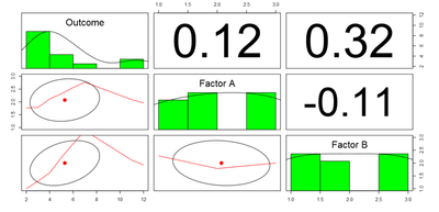
Here two factors (A and B) are used to try and predict the third column (Outcome). Individually both factors seem to have some positive impact on the outcome. However, when both factors have the value “2” the outcome is much higher. Of course, this is not enough data for statistical significance but it illustrates the point.
Using a correlation plot we can see the average 12% correlation between the outcome and Factor A, vs. 32% for Factor B.
If we instead use a tree we see a much richer explanation of the interactions. To get to the highest outcome (bottom right with an average value of 12) we read the tree from the top:
- “Factor B < 1.5” should be “no” (i.e. B should be greater than 1.5),
- “Factor A < 1.5” should also be “no” (we again take the branch to the right),
- “Factor B >= 2.5” should be “no” (again right which is always “no”) and finally,
- “Factor A >= 2.5” should be “no”.
In other words, what this tree tells us is that the highest value for the column “Outcome”, our target value, is achieved when Factor B and A are both: not less than 1.5 and not greater than 2.5. Since we know from our data that both factors are discrete numbers we can simplify this further to say we observe the highest values for “Outcome” when the two factors both have value 2.
In addition to being very valuable tools for analysis; trees are a great introduction to more complex Machine Learning scenarios which we will cover in subsequent posts.
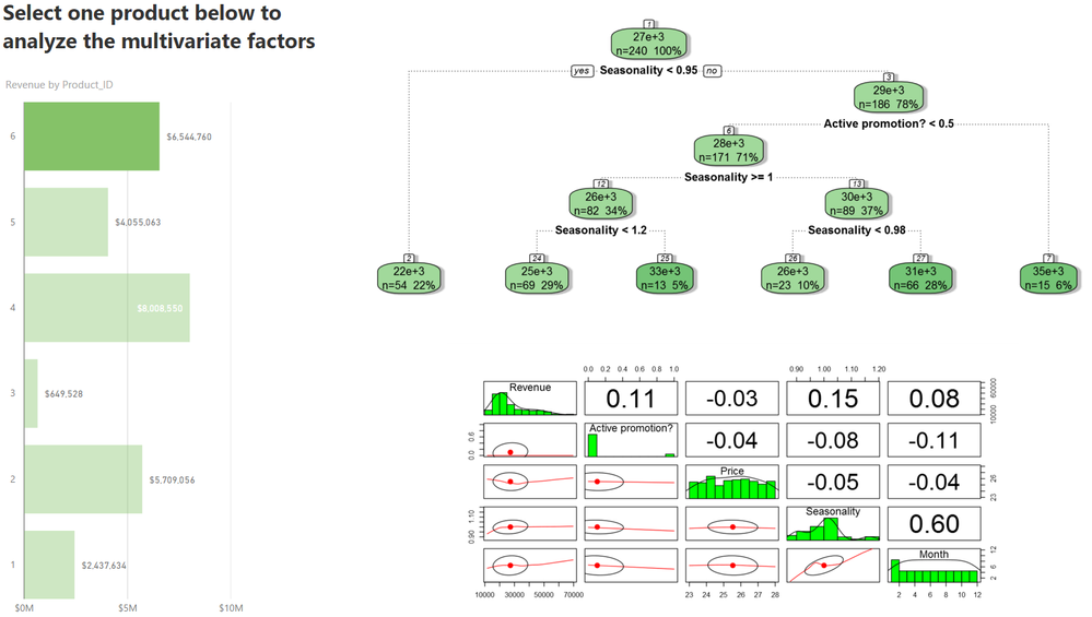
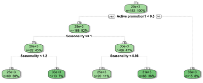
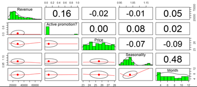
Here we see the same data as in the two previous posts. The bar chart to the left shows the all-up revenue by Product ID and is mainly used to select one product at a time (here product 6 is selected). The tree plot in the top-right shows the same data as the correlation plot below it. Its first input column is revenue and that is the number that it is trying to forecast by splitting the dataset at different thresholds for the other columns. For product 6 the best split is on seasonality (see post 2), followed by promotion. The highest revenue bucket for product 6, with an average of $35k per month, is expected when seasonality is greater than or equal to 0.95 and there is an active promotion for that product:
The second highest revenue bucket with an average of $33k per month is expected when seasonality is greater than or equal to 1.2, regardless of whether there is an active promotion:
Based on that, one conclusion could be that the return on promotions is less in the top season.
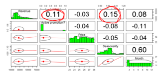
The importance of seasonality to explain revenue could in this case have been guessed by looking at the correlation plot but an insight about diminishing returns on promotions, as the annual cycle picked up, would have been missed:
The tree and correlation plots were both made using R-visuals with the same columns as input.
Using the report
For this report to work in Power BI Desktop you need the packages rpart, rpart.plot, RColorBrewer, RGtk2 and rattle installed. If you have not previously used these packages on your computer, install them by going to your R console in R Studio or other R GUI and copy/paste install.packages(c("rattle", "rpart", "rpart.plot", "RColorBrewer", "RGtk2")).
By clicking on the different products, we can examine which combination of factors are most important in determining a given product’s revenue. Using Power BI’s standard filters we can also drill-in to specific subsets of the data. If we for instance use product 6 again we see that the first split that the model does is on the column “Seasonality”.
To validate the accuracy of this we can add Seasonality to the Page level filters:
This leaves all but the leftmost branch and reduces the all-up correlation between Product 6’s revenue and Seasonality.
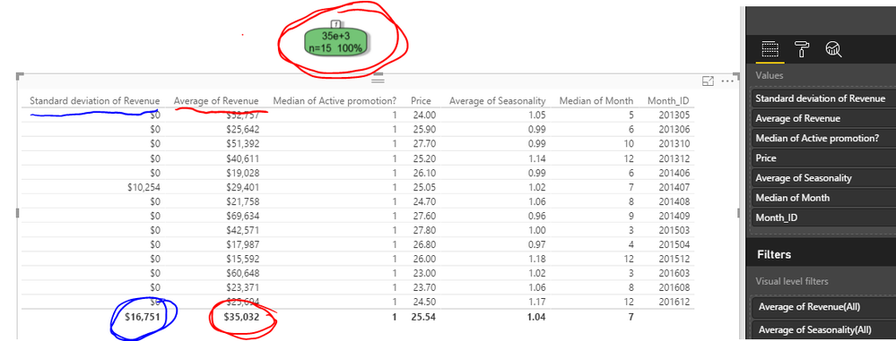
In a second step, we can then add Active promotion to the Page level filters pane and set that to “is greater than 0.5”. That will show NA values in the correlation plot for Active promotion since that column now only has one value, namely “1”. It might therefore be helpful to convert that visualization to a scatter plot, e.g. SandDance to explore the remaining rows of data. For small datasets, a table might be the best option. Here I converted the correlation plot to a standard table and added Revenue again, this time aggregating it as Standard deviation (by using the quick calculation option, under “Values” in the right-hand side menu - visible after clicking the down-arrow button). I also changed the aggregation form for some of the other columns, below to help me understand this subset of data.
As you can see the average of revenue is $35k, identical to the leaf in the tree that we filtered down to. From the values in that column and from the standard deviation of $16.8k we can however see that just filtering on Seasonality and Active promotion still leaves us with a lot of variance in revenue and with 14 data points we need to be cautious reading in too much in these results.
Recreating the report
R visuals will automatically work in Power BI when the report is published to the service, where the most common packages have already been installed, but to get them to work in Power BI Desktop you need a local R installation (please see my previous post for installation instructions).
To create the binary tree R visual:
- Open a pbix file with the relevant data, e.g. the example file attached at the bottom of this blog post and click on the + sign in the bottom row to create a new page.
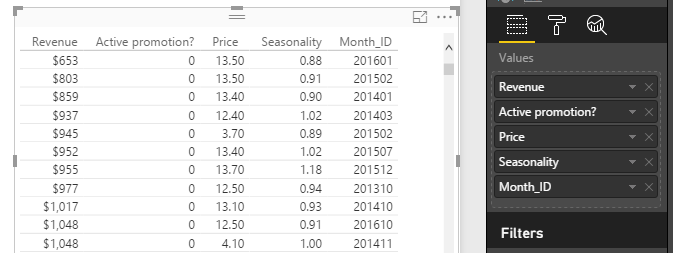
- Insert a simple standard visual, like a table and add the columns that you want to analyze (because an R visual will not display anything until you have added a script this is a great starting point, it also helps you see if you have a problem with your data that will cause the R script to fail, e.g. empty rows or text values mixed with numbers).
- Define granularity. The tree’s splits are calculated to minimize the variance in values by row, for the first column in dataset. It is therefore important to get the granularity right. In this case I want to understand if an investment in a promotion impacts the revenue for that month, using price and seasonality as additional explanatory factors. To make this level of detail explicit I added the column [Month_ID] to the table and verified that it had the aggregation option “Don’t summarize”.
- Scroll through a representative amount of the dataset to ensure that you don’t have any blank or NA values that are likely to cause a runtime error when you run the script. Once I’m happy with the data input (this will be the raw data that R receives) I convert the visual to R by selecting the “R” visual in the canvas and then clicking on the R visualization icon.
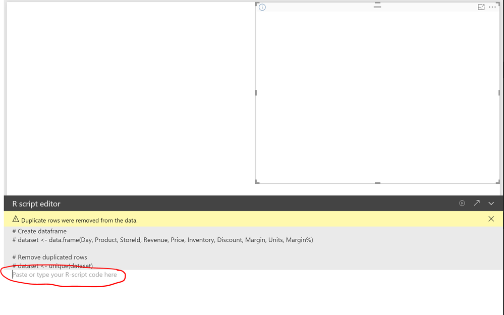
- Add the script using the R script* editor (visible when you select the R visual directly in the canvas). Note, you may have to expand it by clicking on the far-right arrow in the R script editor menu below the canvas.
Once expanded you should see the below, with space for the R script.
Copy/paste the script below into the script editor (any line that starts with # or ## is a comment only and is not executed):
## Load the required libraries ## If you have not installed these packages you will get an error message saying that the libraries were not found. In that case install them by copy/pasting: install.packages(c("rattle", "rpart", "rpart.plot", "RColorBrewer", "RGtk2")) directly in your R Console. The function c() combines values into lists in R. library(rpart) library(rattle) ## rpart, like our previous examples is sensitive to "NAs" and missing values. na.omit() deletes those rows. ## Alternatively, you can use the Power BI filter functions to filter out rows with missing values treenona <- na.omit(dataset) ## In this example I used month id to ensure I aggregated by month. However, I don't want to include it in the calculation so I delete the last column. treenona <- treenona[,1:(ncol(dataset)-1)] ## I'm trying to predict Revenue but here I'll rename it to Sales which I will later reference names(treenona)[1]<-"Sales" ## Calculate the splits to explain/predict column "Sales" ## with a minimum of 7 (21/3) observations per bucket tree.1 <- rpart(Sales ~ .,data=treenona,control=rpart.control(minsplit=21,cp=0.015)) ## Note on the above, the value for "cp" determines if a split is worthwhile, lower value leads to more splits/grannularity ## Plot the tree with text size 110% (1.1) fancyRpartPlot(tree.1, cex = 1.1, sub = NULL) - Use the first arrow in the R script editor to manually execute the script (any change/interaction with the report will also cause the script to be rerun.
To recreate this visual for your own data the steps will be almost identical. It is important however to remember to get the granularity right.
Links and downloads
Decision trees in the R showcase on Power BI
* Third-party programs. This software enables you to obtain software applications from other sources. Those applications are offered and distributed by third parties under their own license terms. Microsoft is not developing, distributing or licensing those applications to you, but instead, as a convenience, enables you to use this software to obtain those applications directly from the application providers.
By using the software, you acknowledge and agree that you are obtaining the applications directly from the third-party providers and under separate license terms, and that it is your responsibility to locate, understand and comply with those license terms. Microsoft grants you no license rights for third-party software or applications that is obtained using this software.
You must be a registered user to add a comment. If you've already registered, sign in. Otherwise, register and sign in.
- Power BI Direct Lake vs Import Mode in Microsoft F...
- Don’t Make My Mistakes: A Key Lesson on Alt Texts ...
- Power BI Data Visualization World Champs - Round 1...
- Introducing User-Defined Functions (UDFs) in DAX: ...
- Get Ready for the Power BI Dataviz World Champs!
- How to Schedule a Monthly Refresh for Power BI Rep...
- Impact IQ: 1-Click Power BI + Fabric Governance So...
- Exploring the Different Types of Slicers in Power ...
- Translytical Task Flows in Power BI
- Semantic Model Version History in Power BI
-
Murtaza_Ghafoor
 on:
Power BI Direct Lake vs Import Mode in Microsoft F...
-
Olayemi_Awofe
 on:
Don’t Make My Mistakes: A Key Lesson on Alt Texts ...
- sergilazaro on: Power BI Data Visualization World Champs - Round 1...
-
EsraaKamal
 on:
Get Ready for the Power BI Dataviz World Champs!
-
venkatasuresh_g
 on:
How to Schedule a Monthly Refresh for Power BI Rep...
-
Ugk161610
 on:
Exploring the Different Types of Slicers in Power ...
-
Abhilash_P
 on:
Translytical Task Flows in Power BI
- Trinkeshh on: DP-600: Microsoft Fabric Analytics Engineer. The C...
-
Abhilash_P
 on:
Power BI in 2025: A Landmark Year That Redefined A...
-
Olayemi_Awofe
 on:
How to Manage One Dataset / Semantic Model, Many R...
-
How to
751 -
Tips & Tricks
734 -
Events
185 -
Support insights
121 -
Opinion
100 -
DAX
66 -
Power BI
65 -
Power Query
62 -
Power BI Dev Camp
45 -
Power BI Desktop
40 -
Roundup
39 -
Dataflow
31 -
Featured User Group Leader
27 -
Power BI Embedded
20 -
Data Protection
19 -
Time Intelligence
19 -
Tips&Tricks
18 -
PowerBI REST API
12 -
Power Query Tips & Tricks
8 -
finance
8 -
Power BI Service
8 -
Direct Query
7 -
Power BI REST API
6 -
Auto ML
6 -
financial reporting
6 -
Data Analysis
6 -
Power Automate
6 -
Data Visualization
6 -
Python
6 -
Tips and Tricks
6 -
Income Statement
5 -
Dax studio
5 -
powerbi
5 -
service
5 -
Power BI PowerShell
5 -
Machine Learning
5 -
RLS
4 -
M language
4 -
Life Sciences
4 -
Paginated Reports
4 -
External tool
4 -
Power BI Goals
4 -
Desktop
4 -
PowerShell
4 -
Bookmarks
4 -
Line chart
4 -
Group By
4 -
community
4 -
Data model
3 -
Conditional Formatting
3 -
Visualisation
3 -
Administration
3 -
M code
3 -
Visuals
3 -
SQL Server 2017 Express Edition
3 -
R script
3 -
Aggregation
3 -
Webinar
3 -
calendar
3 -
Gateways
3 -
R
3 -
M Query
3 -
CALCULATE
3 -
R visual
3 -
Reports
3 -
PowerApps
3 -
Data Science
3 -
Azure
3 -
Custom visual
2 -
VLOOKUP
2 -
pivot
2 -
calculated column
2 -
M
2 -
hierarchies
2 -
Power BI Anniversary
2 -
Language M
2 -
inexact
2 -
Date Comparison
2 -
Power BI Premium Per user
2 -
Forecasting
2 -
REST API
2 -
Editor
2 -
Split
2 -
measure
2 -
Microsoft-flow
2 -
Paginated Report Builder
2 -
Working with Non Standatd Periods
2 -
powerbi.tips
2 -
Custom function
2 -
Reverse
2 -
PUG
2 -
Custom Measures
2 -
Filtering
2 -
Row and column conversion
2 -
Python script
2 -
Nulls
2 -
DVW Analytics
2 -
parameter
2 -
Industrial App Store
2 -
Week
2 -
Date duration
2 -
Formatting
2 -
Weekday Calendar
2 -
Support insights.
2 -
construct list
2 -
slicers
2 -
SAP
2 -
Power Platform
2 -
Workday
2 -
external tools
2 -
index
2 -
RANKX
2 -
Date
2 -
PBI Desktop
2 -
Date Dimension
2 -
Integer
2 -
Visualization
2 -
Power BI Challenge
2 -
Query Parameter
2 -
SharePoint
2 -
Power BI Installation and Updates
2 -
How Things Work
2 -
Tabular Editor
2 -
rank
2 -
ladataweb
2 -
Troubleshooting
2 -
Date DIFF
2 -
Transform data
2 -
Healthcare
2 -
Incremental Refresh
2 -
Number Ranges
2 -
Query Plans
2 -
Power BI & Power Apps
2 -
Random numbers
2 -
Day of the Week
2 -
Retail
1 -
Power BI Report Server
1 -
School
1 -
Cost-Benefit Analysis
1 -
DIisconnected Tables
1 -
Sandbox
1 -
Honeywell
1 -
Combine queries
1 -
X axis at different granularity
1 -
ADLS
1 -
Primary Key
1 -
Microsoft 365 usage analytics data
1 -
Randomly filter
1 -
Week of the Day
1 -
Azure AAD
1 -
query
1 -
Dynamic Visuals
1 -
KPI
1 -
Intro
1 -
Icons
1 -
ISV
1 -
Ties
1 -
unpivot
1 -
Practice Model
1 -
Continuous streak
1 -
ProcessVue
1 -
Create function
1 -
Table.Schema
1 -
Acknowledging
1 -
Postman
1 -
Text.ContainsAny
1 -
Power BI Show
1 -
Get latest sign-in data for each user
1 -
Power Pivot
1 -
API
1 -
Kingsley
1 -
Merge
1 -
variable
1 -
Issues
1 -
function
1 -
stacked column chart
1 -
ho
1 -
ABB
1 -
KNN algorithm
1 -
List.Zip
1 -
optimization
1 -
Artificial Intelligence
1 -
Map Visual
1 -
Text.ContainsAll
1 -
Tuesday
1 -
help
1 -
group
1 -
Scorecard
1 -
Json
1 -
Tops
1 -
financial reporting hierarchies RLS
1 -
Featured Data Stories
1 -
MQTT
1 -
Custom Periods
1 -
Partial group
1 -
Reduce Size
1 -
FBL3N
1 -
Wednesday
1 -
Q&A
1 -
Quick Tips
1 -
data
1 -
PBIRS
1 -
Usage Metrics in Power BI
1 -
Multivalued column
1 -
Pipeline
1 -
Path
1 -
Yokogawa
1 -
Dynamic calculation
1 -
Data Wrangling
1 -
native folded query
1 -
transform table
1 -
UX
1 -
Cell content
1 -
General Ledger
1 -
Thursday
1 -
update
1 -
Table
1 -
Natural Query Language
1 -
Infographic
1 -
automation
1 -
Prediction
1 -
newworkspacepowerbi
1 -
Performance KPIs
1 -
HR Analytics
1 -
keepfilters
1 -
Connect Data
1 -
Financial Year
1 -
Schneider
1 -
dynamically delete records
1 -
Copy Measures
1 -
Friday
1 -
Training
1 -
Event
1 -
Custom Visuals
1 -
Free vs Pro
1 -
Format
1 -
Active Employee
1 -
Custom Date Range on Date Slicer
1 -
refresh error
1 -
PAS
1 -
certain duration
1 -
DA-100
1 -
bulk renaming of columns
1 -
Single Date Picker
1 -
Monday
1 -
PCS
1 -
Saturday
1 -
Slicer
1 -
Visual
1 -
forecast
1 -
Regression
1 -
CICD
1 -
Current Employees
1 -
date hierarchy
1 -
relationship
1 -
SIEMENS
1 -
Multiple Currency
1 -
Power BI Premium
1 -
On-premises data gateway
1 -
Binary
1 -
Power BI Connector for SAP
1 -
Sunday
1 -
Workspace
1 -
Announcement
1 -
Features
1 -
domain
1 -
pbiviz
1 -
sport statistics
1 -
Intelligent Plant
1 -
Circular dependency
1 -
GE
1 -
Exchange rate
1 -
Dendrogram
1 -
range of values
1 -
activity log
1 -
Decimal
1 -
Charticulator Challenge
1 -
Field parameters
1 -
deployment
1 -
ssrs traffic light indicators
1 -
SQL
1 -
trick
1 -
Scripts
1 -
Color Map
1 -
Industrial
1 -
Weekday
1 -
Working Date
1 -
Space Issue
1 -
Emerson
1 -
Date Table
1 -
Cluster Analysis
1 -
Stacked Area Chart
1 -
union tables
1 -
Number
1 -
Start of Week
1 -
Tips& Tricks
1 -
Theme Colours
1 -
Text
1 -
Flow
1 -
Publish to Web
1 -
Extract
1 -
Topper Color On Map
1 -
Historians
1 -
context transition
1 -
Custom textbox
1 -
OPC
1 -
Zabbix
1 -
Label: DAX
1 -
Business Analysis
1 -
Supporting Insight
1 -
rank value
1 -
Synapse
1 -
End of Week
1 -
Tips&Trick
1 -
Excel
1 -
Showcase
1 -
custom connector
1 -
Waterfall Chart
1 -
Power BI On-Premise Data Gateway
1 -
patch
1 -
Top Category Color
1 -
A&E data
1 -
Previous Order
1 -
Substring
1 -
Wonderware
1 -
Power M
1 -
Format DAX
1 -
Custom functions
1 -
accumulative
1 -
DAX&Power Query
1 -
Premium Per User
1 -
GENERATESERIES
1 -
Report Server
1 -
Audit Logs
1 -
analytics pane
1 -
step by step
1 -
Top Brand Color on Map
1 -
Tutorial
1 -
Previous Date
1 -
XMLA End point
1 -
color reference
1 -
Date Time
1 -
Marker
1 -
Lineage
1 -
CSV file
1 -
conditional accumulative
1 -
Matrix Subtotal
1 -
Check
1 -
null value
1 -
Show and Tell
1 -
Cumulative Totals
1 -
Report Theme
1 -
Bookmarking
1 -
oracle
1 -
mahak
1 -
pandas
1 -
Networkdays
1 -
Button
1 -
Dataset list
1 -
Keyboard Shortcuts
1 -
Fill Function
1 -
LOOKUPVALUE()
1 -
Tips &Tricks
1 -
Plotly package
1 -
Sameperiodlastyear
1 -
Office Theme
1 -
matrix
1 -
bar chart
1 -
Measures
1 -
powerbi argentina
1 -
Canvas Apps
1 -
total
1 -
Filter context
1 -
Difference between two dates
1 -
get data
1 -
OSI
1 -
Query format convert
1 -
ETL
1 -
Json files
1 -
Merge Rows
1 -
CONCATENATEX()
1 -
take over Datasets;
1 -
Networkdays.Intl
1 -
refresh M language Python script Support Insights
1 -
Tutorial Requests
1 -
Governance
1 -
Fun
1 -
Power BI gateway
1 -
gateway
1 -
Elementary
1 -
Custom filters
1 -
Vertipaq Analyzer
1 -
powerbi cordoba
1 -
Model Driven Apps
1 -
REMOVEFILTERS
1 -
XMLA endpoint
1 -
translations
1 -
OSI pi
1 -
Parquet
1 -
Change rows to columns
1 -
remove spaces
1 -
Get row and column totals
1
- 01-11-2026 - 01-17-2026
- 01-04-2026 - 01-10-2026
- 12-21-2025 - 12-27-2025
- 12-14-2025 - 12-20-2025
- 12-07-2025 - 12-13-2025
- 11-30-2025 - 12-06-2025
- 11-23-2025 - 11-29-2025
- 11-16-2025 - 11-22-2025
- 11-09-2025 - 11-15-2025
- 11-02-2025 - 11-08-2025
- 10-26-2025 - 11-01-2025
- 10-19-2025 - 10-25-2025
- View Complete Archives

