- Subscribe to RSS Feed
- Mark as New
- Mark as Read
- Bookmark
- Subscribe
- Printer Friendly Page
- Report Inappropriate Content
- Subscribe to RSS Feed
- Mark as New
- Mark as Read
- Bookmark
- Subscribe
- Printer Friendly Page
- Report Inappropriate Content
Earlier, when we had a requirement to bring legend and data labels together in a bar chart, we used to look for some custom visuals, but with Measure driven data labels in the May 2023 update, we can achieve this in standard bar charts and line charts.
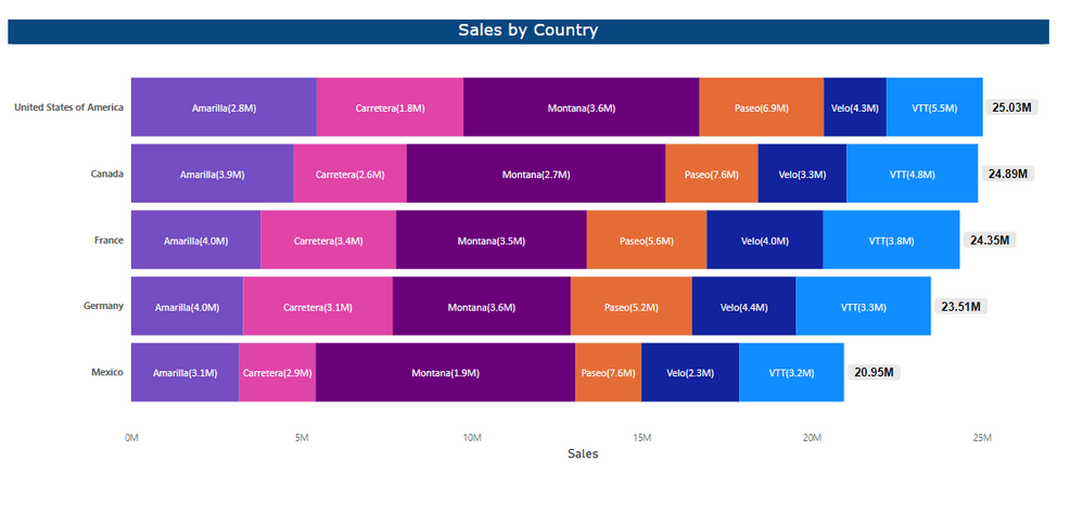
Here we are going to see how can we show the legend and data labels together in a stacked bar chart but in general
we can follow the same approach for other bar and line charts.
Requirement:
For the below example, we are going to use the sample data available in Power BI Desktop.
To achieve the requirement, first we need to drag and drop the required column to the visual fields pane, here the requirement is to show the sales values for countries split by product. I put all the required fields from the field list to fields pane.
Y-axis : Country
X-axis : Sales
Legend : Product
Now we need to write a measure like below to concatenate the legends and sales together in the data lables (It may vary depending on the requirement),
Sales Label =
--Summing up the sales and format it to millions
VAR _salesMillions =
    FORMAT ( SUM ( financials[ Sales] ), "#,,.0" ) & "M"
--concatenating product and sales for the current context
VAR _result = SELECTEDVALUE(financials[Product]) &"("& _salesMillions&")"
RETURN _result
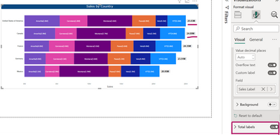
Next naviagate to the data labels option of the visuals and turn it on,
Under the values option we can see custom label,
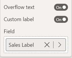
And the turn on the custom label option, now we can see the option for add data will be enabled.
Then you can add the measure that we have already created for the labels.
If you don't see any labels, try to adjust (decrease/increase) the font size of the data labels and also turn on the overflow text option.
And to see the Totals we can turn on total labels.
Now can see the legends and data labels togehter in the visual.
Hope this article will be helpful. Please let me know your comments and suggestions.
Regards,
Arul
You must be a registered user to add a comment. If you've already registered, sign in. Otherwise, register and sign in.
- How to Use the Numeric Range Parameter in Power BI
- Power BI Report subscriptions does not respect RLS
- Programmatically deploy Semantic Models and Report...
- Retaining Slicer Selection Between Bookmarks Using...
- TOP DAX function for everyday use - Filter Functio...
- 🏆 Power BI DataViz World Championships | Week 4 F...
- 🏆 Power BI DataViz World Championships | Week 4 W...
- AI-Driven Approvals: Smarter SOX Compliance Withou...
- How to Calculate Cumulative Sum in Power BI
- 🏆 Power BI DataViz World Championships | Week 3 F...
-
BunzietheBoo
 on:
🏆 Power BI DataViz World Championships | Week 4 F...
-
thefarside
 on:
🏆 Power BI DataViz World Championships | Week 4 W...
- Magudeswaran_MR on: How to Calculate Cumulative Sum in Power BI
-
Dera__Igboejesi
 on:
🏆 Power BI DataViz World Championships | Week 3 F...
- M_S_MANOHAR on: Dynamic Subscriptions
-
LucasKoch2900
 on:
🏆 Power BI DataViz World Championships | Week 3 W...
-
 slindsay
on:
🏆 Power BI DataViz World Championships | Week 4 |...
-
JamesDBartlett3
 on:
PBIP fx hack: dynamic expressions for properties -...
- TBH on: How to add Gradient Text in Power BI dashboard
-
Jasmine_319
 on:
🏆 Power BI DataViz World Championships | Week 2 F...
-
How To
662 -
Tips & Tricks
630 -
Events
130 -
Support insights
121 -
Opinion
81 -
DAX
66 -
Power BI
65 -
Power Query
62 -
Power BI Dev Camp
45 -
Power BI Desktop
40 -
Roundup
38 -
Power BI Embedded
20 -
Time Intelligence
19 -
Tips&Tricks
18 -
Featured User Group Leader
16 -
PowerBI REST API
12 -
Dataflow
10 -
Data Protection
8 -
Power BI Service
8 -
Power Query Tips & Tricks
8 -
finance
8 -
Direct Query
7 -
Auto ML
6 -
financial reporting
6 -
Data Analysis
6 -
Power Automate
6 -
Data Visualization
6 -
Python
6 -
Power BI REST API
6 -
powerbi
5 -
service
5 -
Power BI PowerShell
5 -
Machine Learning
5 -
Income Statement
5 -
Dax studio
5 -
Power BI Goals
4 -
PowerShell
4 -
Desktop
4 -
Bookmarks
4 -
Line chart
4 -
Group By
4 -
community
4 -
RLS
4 -
M language
4 -
Paginated Reports
4 -
External tool
4 -
calendar
3 -
Gateways
3 -
R
3 -
M Query
3 -
Webinar
3 -
CALCULATE
3 -
R visual
3 -
Reports
3 -
PowerApps
3 -
Data Science
3 -
Azure
3 -
Data model
3 -
Conditional Formatting
3 -
Visualisation
3 -
Life Sciences
3 -
Administration
3 -
M code
3 -
Visuals
3 -
SQL Server 2017 Express Edition
3 -
R script
3 -
Aggregation
3 -
parameter
2 -
Industrial App Store
2 -
Week
2 -
Date duration
2 -
Formatting
2 -
Weekday Calendar
2 -
Support insights.
2 -
construct list
2 -
slicers
2 -
SAP
2 -
Power Platform
2 -
Workday
2 -
external tools
2 -
index
2 -
RANKX
2 -
PBI Desktop
2 -
Date Dimension
2 -
Integer
2 -
Visualization
2 -
Power BI Challenge
2 -
Query Parameter
2 -
Date
2 -
SharePoint
2 -
Power BI Installation and Updates
2 -
How Things Work
2 -
Tabular Editor
2 -
rank
2 -
ladataweb
2 -
Troubleshooting
2 -
Date DIFF
2 -
Transform data
2 -
Healthcare
2 -
Tips and Tricks
2 -
Incremental Refresh
2 -
Number Ranges
2 -
Query Plans
2 -
Power BI & Power Apps
2 -
Random numbers
2 -
Day of the Week
2 -
Custom Visual
2 -
VLOOKUP
2 -
pivot
2 -
calculated column
2 -
M
2 -
hierarchies
2 -
Power BI Anniversary
2 -
Language M
2 -
inexact
2 -
Date Comparison
2 -
Power BI Premium Per user
2 -
Forecasting
2 -
REST API
2 -
Editor
2 -
Split
2 -
measure
2 -
Microsoft-flow
2 -
Paginated Report Builder
2 -
Working with Non Standatd Periods
2 -
powerbi.tips
2 -
Custom function
2 -
Reverse
2 -
PUG
2 -
Custom Measures
2 -
Filtering
2 -
Row and column conversion
2 -
Python script
2 -
Nulls
2 -
DVW Analytics
2 -
Q&A
1 -
Event
1 -
Custom Visuals
1 -
Free vs Pro
1 -
Format
1 -
Active Employee
1 -
Custom Date Range on Date Slicer
1 -
refresh error
1 -
PAS
1 -
certain duration
1 -
DA-100
1 -
bulk renaming of columns
1 -
Single Date Picker
1 -
Monday
1 -
PCS
1 -
Saturday
1 -
update
1 -
Slicer
1 -
Visual
1 -
forecast
1 -
Regression
1 -
CICD
1 -
Current Employees
1 -
date hierarchy
1 -
relationship
1 -
SIEMENS
1 -
Multiple Currency
1 -
Power BI Premium
1 -
On-premises data gateway
1 -
Binary
1 -
Power BI Connector for SAP
1 -
Sunday
1 -
Training
1 -
Announcement
1 -
Features
1 -
domain
1 -
pbiviz
1 -
sport statistics
1 -
Intelligent Plant
1 -
Circular dependency
1 -
GE
1 -
Exchange rate
1 -
Dendrogram
1 -
range of values
1 -
activity log
1 -
Decimal
1 -
Charticulator Challenge
1 -
Field parameters
1 -
deployment
1 -
ssrs traffic light indicators
1 -
SQL
1 -
trick
1 -
Scripts
1 -
Color Map
1 -
Industrial
1 -
Weekday
1 -
Working Date
1 -
Space Issue
1 -
Emerson
1 -
Date Table
1 -
Cluster Analysis
1 -
Stacked Area Chart
1 -
union tables
1 -
Number
1 -
Start of Week
1 -
Tips& Tricks
1 -
Workspace
1 -
Theme Colours
1 -
Text
1 -
Flow
1 -
Publish to Web
1 -
Extract
1 -
Topper Color On Map
1 -
Historians
1 -
context transition
1 -
Custom textbox
1 -
OPC
1 -
Zabbix
1 -
Label: DAX
1 -
Business Analysis
1 -
Supporting Insight
1 -
rank value
1 -
Synapse
1 -
End of Week
1 -
Tips&Trick
1 -
Showcase
1 -
custom connector
1 -
Waterfall Chart
1 -
Power BI On-Premise Data Gateway
1 -
patch
1 -
Top Category Color
1 -
A&E data
1 -
Previous Order
1 -
Substring
1 -
Wonderware
1 -
Power M
1 -
Format DAX
1 -
Custom functions
1 -
accumulative
1 -
DAX&Power Query
1 -
Premium Per User
1 -
GENERATESERIES
1 -
Report Server
1 -
Audit Logs
1 -
analytics pane
1 -
step by step
1 -
Top Brand Color on Map
1 -
Tutorial
1 -
Previous Date
1 -
XMLA End point
1 -
color reference
1 -
Date Time
1 -
Marker
1 -
Lineage
1 -
CSV file
1 -
conditional accumulative
1 -
Matrix Subtotal
1 -
Check
1 -
null value
1 -
Excel
1 -
Cumulative Totals
1 -
Report Theme
1 -
Bookmarking
1 -
oracle
1 -
mahak
1 -
pandas
1 -
Networkdays
1 -
Button
1 -
Dataset list
1 -
Keyboard Shortcuts
1 -
Fill Function
1 -
LOOKUPVALUE()
1 -
Tips &Tricks
1 -
Plotly package
1 -
Sameperiodlastyear
1 -
Office Theme
1 -
matrix
1 -
bar chart
1 -
Measures
1 -
powerbi argentina
1 -
Canvas Apps
1 -
total
1 -
Filter context
1 -
Difference between two dates
1 -
get data
1 -
OSI
1 -
Query format convert
1 -
ETL
1 -
Json files
1 -
Merge Rows
1 -
CONCATENATEX()
1 -
take over Datasets;
1 -
Networkdays.Intl
1 -
refresh M language Python script Support Insights
1 -
Governance
1 -
Fun
1 -
Power BI gateway
1 -
gateway
1 -
Elementary
1 -
Custom filters
1 -
Vertipaq Analyzer
1 -
powerbi cordoba
1 -
Model Driven Apps
1 -
REMOVEFILTERS
1 -
XMLA endpoint
1 -
translations
1 -
OSI pi
1 -
Parquet
1 -
Change rows to columns
1 -
remove spaces
1 -
Get row and column totals
1 -
Retail
1 -
Power BI Report Server
1 -
School
1 -
Cost-Benefit Analysis
1 -
DIisconnected Tables
1 -
Sandbox
1 -
Honeywell
1 -
Combine queries
1 -
X axis at different granularity
1 -
ADLS
1 -
Primary Key
1 -
Microsoft 365 usage analytics data
1 -
Randomly filter
1 -
Week of the Day
1 -
Azure AAD
1 -
query
1 -
Dynamic Visuals
1 -
KPI
1 -
Intro
1 -
Icons
1 -
ISV
1 -
Ties
1 -
unpivot
1 -
Practice Model
1 -
Continuous streak
1 -
ProcessVue
1 -
Create function
1 -
Table.Schema
1 -
Acknowledging
1 -
Postman
1 -
Text.ContainsAny
1 -
Power BI Show
1 -
Get latest sign-in data for each user
1 -
API
1 -
Kingsley
1 -
Merge
1 -
variable
1 -
Issues
1 -
function
1 -
stacked column chart
1 -
ho
1 -
ABB
1 -
KNN algorithm
1 -
List.Zip
1 -
optimization
1 -
Artificial Intelligence
1 -
Map Visual
1 -
Text.ContainsAll
1 -
Tuesday
1 -
help
1 -
group
1 -
Scorecard
1 -
Json
1 -
Tops
1 -
financial reporting hierarchies RLS
1 -
Featured Data Stories
1 -
MQTT
1 -
Custom Periods
1 -
Partial group
1 -
Reduce Size
1 -
FBL3N
1 -
Wednesday
1 -
Power Pivot
1 -
Quick Tips
1 -
data
1 -
PBIRS
1 -
Usage Metrics in Power BI
1 -
Multivalued column
1 -
Pipeline
1 -
Path
1 -
Yokogawa
1 -
Dynamic calculation
1 -
Data Wrangling
1 -
native folded query
1 -
transform table
1 -
UX
1 -
Cell content
1 -
General Ledger
1 -
Thursday
1 -
Table
1 -
Natural Query Language
1 -
Infographic
1 -
automation
1 -
Prediction
1 -
newworkspacepowerbi
1 -
Performance KPIs
1 -
HR Analytics
1 -
keepfilters
1 -
Connect Data
1 -
Financial Year
1 -
Schneider
1 -
dynamically delete records
1 -
Copy Measures
1 -
Friday
1
- 03-30-2025 - 04-01-2025
- 03-23-2025 - 03-29-2025
- 03-16-2025 - 03-22-2025
- 03-09-2025 - 03-15-2025
- 03-02-2025 - 03-08-2025
- 02-23-2025 - 03-01-2025
- 02-16-2025 - 02-22-2025
- 02-09-2025 - 02-15-2025
- 02-02-2025 - 02-08-2025
- 01-26-2025 - 02-01-2025
- 01-19-2025 - 01-25-2025
- 01-12-2025 - 01-18-2025
- 01-05-2025 - 01-11-2025
- View Complete Archives


