New Offer! Become a Certified Fabric Data Engineer
Check your eligibility for this 50% exam voucher offer and join us for free live learning sessions to get prepared for Exam DP-700.
Get StartedDon't miss out! 2025 Microsoft Fabric Community Conference, March 31 - April 2, Las Vegas, Nevada. Use code MSCUST for a $150 discount. Prices go up February 11th. Register now.
- Microsoft Fabric Community
- Fabric community blogs
- Power BI Community Blog
- Follow-up key milestones in Power BI : the example...
- Subscribe to RSS Feed
- Mark as New
- Mark as Read
- Bookmark
- Subscribe
- Printer Friendly Page
- Report Inappropriate Content
Follow-up key milestones in Power BI : the example of Pulse Chart
- Subscribe to RSS Feed
- Mark as New
- Mark as Read
- Bookmark
- Subscribe
- Printer Friendly Page
- Report Inappropriate Content
In any reporting project, access to data is not enough.
The commercial director who follows the evolution of sales must be able to viualize in his data when he hired the 3 sales representatives.
The marketing director must know when he triggered the 1st promotion campaign on his products.
The financial director must be able to visualize accurately how and when acquired companies are consolidated in his group’s scope
The HR director must see in a nutshell when his employees received their bonus, and the impacts that it had on the total payroll.
For that, the ideal chart in Power BI is called the Pulse Chart. It is a custom visual, which means it is not in the native list of visuals that exist in Power BI.
To use it, you will need to import it. In the visualizations pane, click on the symbol with 3 dots.

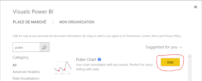 Office Store
 Once you are arrived on the Office Store, enter « pulse » in the search bar, then, once the visual is proposed, click on « Add ». You imported successfully the visual. You can now use it in order to create graphs with beautiful tooltips.
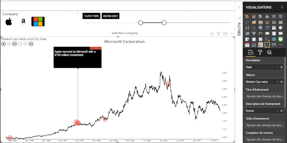
The Pulse Chart visual has locations for its 6 different fields.
- Timestamp
- Values
- Event Title
- Event Description
- Event Size
- Runner Counter
All these fields allow a complete customization of the visual, but the result is already excellent with only 3 fields.
For ourselves, we will need to use :
- Timestamp (our dates axis, we’ll drag our “Month” Field there)
- Values (the field which contains data enabling the creation of the curve, we’ll drag the field “Market Cap Value” there)
- Events (the field which contains data enabling the creation of tooltips, we’ll drag the field “Events” there)
Let’s go back to our data model. To feed the field Events with key milestones, nothing really difficult. That could be done using simple conditional columns in Power BI.
An example of rules that could be created by the conditional column :
IF [Date] = June, 29th 2007 AND IF [Company] = "AAPL"
THEN "Apple Founder & CEO Steve Jobs introduces the iPhone"
Let's check that :
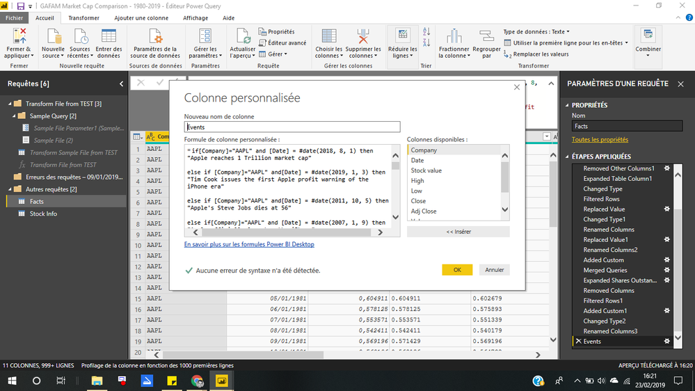
In our data model, the fact table contains a column with the name of several companies, that we will call [Company], and a Date column that we will call [Month].
The idea is to identify some important dates for each company, and then to display the “Key Milestones” to these dates only, for related companies only.
This is a double instruction. Unfortunatly, conditional columns do not support double instructions, but only single ones.
Thus, we are obliged to create a custom column in the query editor.

Syntax is of that kind :
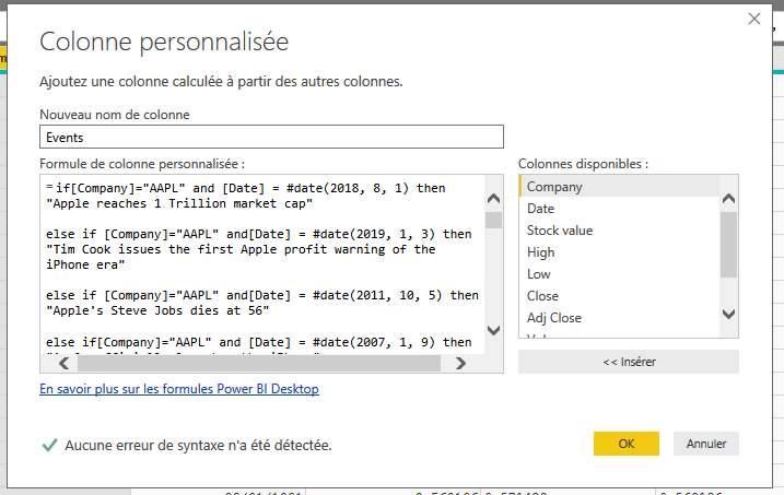
Just a little "else null" in the end of the code will help us not to have any syntax error.
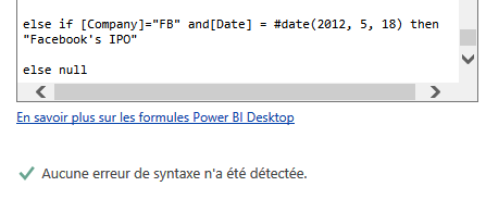
You now have created beautiful dashboard to do some story telling !
Thank you,
Augustin de la Fouchardiere
Senior Business Intelligence Consultant
Former consultant at Société Générale, CGI, Banque de France.

You must be a registered user to add a comment. If you've already registered, sign in. Otherwise, register and sign in.
- Power BI - Powered by Copilot
- Different Ways To Display Hyperlinks In Power BI T...
- Unpivoting vs. Splitting by Delimiter: When to Use...
- Create Pareto Chart In Power BI
- 🏆 Power BI Data Visualization World Championships...
- The Power of No-Code/Low-Code Data Analysis on Emb...
- The Power of No-Code/Low-Code Data Analysis on Emb...
- Microsoft Fabric: Implementing Version Control for...
- How to show slicer selected values in Power BI Rep...
- Optimizing Direct Lake Mode in Microsoft Fabric: A...
-
 PradipVS
on:
Power BI - Powered by Copilot
- mapalcich on: 🏆 Power BI Data Visualization World Championships...
- meriamzaoioui on: Microsoft Fabric: Implementing Version Control for...
-
_MMahmood_
 on:
Token-based pagination In Power Query
- juanpr on: NEW OFFER! Discount Certification Voucher - Fabric...
- Zarina on: Boosting Sales and Customer Satisfaction: The Powe...
-
 danextian
on:
SVG based Power BI Semantic Model Columns and Meas...
- Zainul0101 on: Microsoft Power BI vs Microsoft Fabric
-
tanehome1
 on:
Introducing the new text slicer in Power BI
- akhillamcor on: Explore Small Multiples for the New Card Visual in...
-
How To
635 -
Tips & Tricks
603 -
Support insights
121 -
Events
112 -
Opinion
77 -
DAX
66 -
Power BI
65 -
Power Query
62 -
Power BI Dev Camp
45 -
Power BI Desktop
40 -
Roundup
36 -
Power BI Embedded
20 -
Time Intelligence
19 -
Tips&Tricks
18 -
Featured User Group Leader
13 -
PowerBI REST API
12 -
Power BI Service
8 -
Power Query Tips & Tricks
8 -
finance
8 -
Dataflow
7 -
Direct Query
7 -
Data Visualization
6 -
Python
6 -
Power BI REST API
6 -
Auto ML
6 -
financial reporting
6 -
Data Analysis
6 -
Power Automate
6 -
Power BI PowerShell
5 -
Machine Learning
5 -
Income Statement
5 -
Dax studio
5 -
powerbi
5 -
service
5 -
PowerShell
4 -
Desktop
4 -
Bookmarks
4 -
Line chart
4 -
Group By
4 -
community
4 -
RLS
4 -
M language
4 -
Paginated Reports
4 -
External tool
4 -
Power BI Goals
4 -
Reports
3 -
PowerApps
3 -
Data Science
3 -
Azure
3 -
Data model
3 -
Conditional Formatting
3 -
Visualisation
3 -
Administration
3 -
M code
3 -
Visuals
3 -
SQL Server 2017 Express Edition
3 -
R script
3 -
Aggregation
3 -
Data Protection
3 -
calendar
3 -
Gateways
3 -
R
3 -
M Query
3 -
Webinar
3 -
CALCULATE
3 -
R visual
3 -
PBI Desktop
2 -
Date Dimension
2 -
Integer
2 -
Visualization
2 -
Power BI Challenge
2 -
Query Parameter
2 -
Date
2 -
SharePoint
2 -
Power BI Installation and Updates
2 -
How Things Work
2 -
Tabular Editor
2 -
rank
2 -
ladataweb
2 -
Troubleshooting
2 -
Date DIFF
2 -
Transform data
2 -
Tips and Tricks
2 -
Incremental Refresh
2 -
Number Ranges
2 -
Query Plans
2 -
Power BI & Power Apps
2 -
Random numbers
2 -
Day of the Week
2 -
Custom Visual
2 -
VLOOKUP
2 -
pivot
2 -
calculated column
2 -
M
2 -
hierarchies
2 -
Power BI Anniversary
2 -
Language M
2 -
inexact
2 -
Date Comparison
2 -
Power BI Premium Per user
2 -
Forecasting
2 -
REST API
2 -
Editor
2 -
Split
2 -
measure
2 -
Microsoft-flow
2 -
Paginated Report Builder
2 -
Working with Non Standatd Periods
2 -
powerbi.tips
2 -
Custom function
2 -
Reverse
2 -
PUG
2 -
Custom Measures
2 -
Filtering
2 -
Row and column conversion
2 -
Python script
2 -
Nulls
2 -
DVW Analytics
2 -
parameter
2 -
Industrial App Store
2 -
Week
2 -
Date duration
2 -
Formatting
2 -
Weekday Calendar
2 -
Support insights.
2 -
construct list
2 -
slicers
2 -
SAP
2 -
Power Platform
2 -
Workday
2 -
external tools
2 -
index
2 -
RANKX
2 -
Workspace
1 -
Theme Colours
1 -
Text
1 -
Flow
1 -
Publish to Web
1 -
Extract
1 -
Topper Color On Map
1 -
Historians
1 -
context transition
1 -
Custom textbox
1 -
OPC
1 -
Zabbix
1 -
Label: DAX
1 -
Business Analysis
1 -
Supporting Insight
1 -
rank value
1 -
Synapse
1 -
End of Week
1 -
Tips&Trick
1 -
Showcase
1 -
custom connector
1 -
Waterfall Chart
1 -
Power BI On-Premise Data Gateway
1 -
patch
1 -
Top Category Color
1 -
A&E data
1 -
Previous Order
1 -
Substring
1 -
Wonderware
1 -
Power M
1 -
Format DAX
1 -
Custom functions
1 -
accumulative
1 -
DAX&Power Query
1 -
Premium Per User
1 -
GENERATESERIES
1 -
Report Server
1 -
Audit Logs
1 -
analytics pane
1 -
step by step
1 -
Top Brand Color on Map
1 -
Tutorial
1 -
Previous Date
1 -
XMLA End point
1 -
color reference
1 -
Date Time
1 -
Marker
1 -
Lineage
1 -
CSV file
1 -
conditional accumulative
1 -
Matrix Subtotal
1 -
Check
1 -
null value
1 -
Excel
1 -
Cumulative Totals
1 -
Report Theme
1 -
Bookmarking
1 -
oracle
1 -
mahak
1 -
pandas
1 -
Networkdays
1 -
Button
1 -
Dataset list
1 -
Keyboard Shortcuts
1 -
Fill Function
1 -
LOOKUPVALUE()
1 -
Tips &Tricks
1 -
Plotly package
1 -
refresh M language Python script Support Insights
1 -
Sameperiodlastyear
1 -
Office Theme
1 -
matrix
1 -
bar chart
1 -
Measures
1 -
powerbi argentina
1 -
Canvas Apps
1 -
total
1 -
Filter context
1 -
Difference between two dates
1 -
get data
1 -
OSI
1 -
Query format convert
1 -
ETL
1 -
Json files
1 -
Merge Rows
1 -
CONCATENATEX()
1 -
take over Datasets;
1 -
Networkdays.Intl
1 -
Get row and column totals
1 -
Governance
1 -
Fun
1 -
Power BI gateway
1 -
gateway
1 -
Elementary
1 -
Custom filters
1 -
Vertipaq Analyzer
1 -
powerbi cordoba
1 -
Model Driven Apps
1 -
REMOVEFILTERS
1 -
XMLA endpoint
1 -
translations
1 -
OSI pi
1 -
Parquet
1 -
Change rows to columns
1 -
remove spaces
1 -
Azure AAD
1 -
Retail
1 -
Power BI Report Server
1 -
School
1 -
Cost-Benefit Analysis
1 -
DIisconnected Tables
1 -
Sandbox
1 -
Honeywell
1 -
Combine queries
1 -
X axis at different granularity
1 -
ADLS
1 -
Primary Key
1 -
Microsoft 365 usage analytics data
1 -
Randomly filter
1 -
Week of the Day
1 -
Get latest sign-in data for each user
1 -
query
1 -
Dynamic Visuals
1 -
KPI
1 -
Intro
1 -
Icons
1 -
ISV
1 -
Ties
1 -
unpivot
1 -
Practice Model
1 -
Continuous streak
1 -
ProcessVue
1 -
Create function
1 -
Table.Schema
1 -
Acknowledging
1 -
Postman
1 -
Text.ContainsAny
1 -
Power BI Show
1 -
Life Sciences
1 -
API
1 -
Kingsley
1 -
Merge
1 -
variable
1 -
Issues
1 -
function
1 -
stacked column chart
1 -
ho
1 -
ABB
1 -
KNN algorithm
1 -
List.Zip
1 -
optimization
1 -
Artificial Intelligence
1 -
Map Visual
1 -
Text.ContainsAll
1 -
Tuesday
1 -
help
1 -
group
1 -
Scorecard
1 -
Json
1 -
Tops
1 -
financial reporting hierarchies RLS
1 -
Featured Data Stories
1 -
MQTT
1 -
Custom Periods
1 -
Partial group
1 -
Reduce Size
1 -
FBL3N
1 -
Wednesday
1 -
Power Pivot
1 -
Quick Tips
1 -
data
1 -
PBIRS
1 -
Usage Metrics in Power BI
1 -
Multivalued column
1 -
Pipeline
1 -
Path
1 -
Yokogawa
1 -
Dynamic calculation
1 -
Data Wrangling
1 -
native folded query
1 -
transform table
1 -
UX
1 -
Cell content
1 -
General Ledger
1 -
Thursday
1 -
Table
1 -
Natural Query Language
1 -
Infographic
1 -
automation
1 -
Prediction
1 -
newworkspacepowerbi
1 -
Performance KPIs
1 -
HR Analytics
1 -
keepfilters
1 -
Connect Data
1 -
Financial Year
1 -
Schneider
1 -
dynamically delete records
1 -
Copy Measures
1 -
Friday
1 -
Q&A
1 -
Event
1 -
Custom Visuals
1 -
Free vs Pro
1 -
Format
1 -
Active Employee
1 -
Custom Date Range on Date Slicer
1 -
refresh error
1 -
PAS
1 -
certain duration
1 -
DA-100
1 -
bulk renaming of columns
1 -
Single Date Picker
1 -
Monday
1 -
PCS
1 -
Saturday
1 -
update
1 -
Slicer
1 -
Visual
1 -
forecast
1 -
Regression
1 -
CICD
1 -
Current Employees
1 -
date hierarchy
1 -
relationship
1 -
SIEMENS
1 -
Multiple Currency
1 -
Power BI Premium
1 -
On-premises data gateway
1 -
Binary
1 -
Power BI Connector for SAP
1 -
Sunday
1 -
Training
1 -
Announcement
1 -
Features
1 -
domain
1 -
pbiviz
1 -
sport statistics
1 -
Intelligent Plant
1 -
Circular dependency
1 -
GE
1 -
Exchange rate
1 -
Dendrogram
1 -
range of values
1 -
activity log
1 -
Decimal
1 -
Charticulator Challenge
1 -
Field parameters
1 -
deployment
1 -
ssrs traffic light indicators
1 -
SQL
1 -
trick
1 -
Scripts
1 -
Color Map
1 -
Industrial
1 -
Weekday
1 -
Working Date
1 -
Space Issue
1 -
Emerson
1 -
Date Table
1 -
Cluster Analysis
1 -
Stacked Area Chart
1 -
union tables
1 -
Number
1 -
Start of Week
1 -
Tips& Tricks
1