Forum Discussion

Create Sankey Graphics
Hi everyone.
I need your help with this graphics.
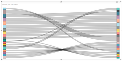
In this case the origin and the destination are the same.
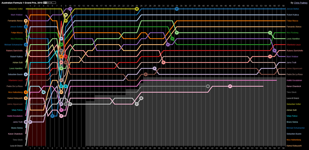
But, I need to add one more axis, the month of the year.
Throughout the month each value of the origin and destination is obtaining a different position.
In short, I need to come up with something like this:
Sankey Diagram is not what you need. It looks like a new custom visual that should be implemented.
We'd recommend to ask community to develop this Custom Visual to implement required funtionality.
Ignat Vilesov,
Software Engineer
Microsoft Power BI Custom Visuals

1 Reply
- v-viigCommunity Champion
Sankey Diagram is not what you need. It looks like a new custom visual that should be implemented.
We'd recommend to ask community to develop this Custom Visual to implement required funtionality.
Ignat Vilesov,
Software Engineer
Microsoft Power BI Custom Visuals